Most lot of the work I looked at lacked in the same things/had the same negatives throughout their publications. In terms of layout, the work that I looked at was not professional enough; photos and text were crammed into one page, where as the publications that used one image per page worked best. Also the text in the publications that I saw would of worked better aesthetically if it was kept separate and small. Another layout issue in the work I saw was that it was too rough; pages with paint marks and physically stuck paper could have been scanned in, edited and then printed as one sheet.
Furthermore, the imagery and photographs in some of the publications could have been shot and edited more professionally; using better quality cameras, thinking about angles etc. Another way that certain publications were better than others were by the 500 word evaluations. The people that spoke in depth about the colour theory how they interpreted the theory through their ideas and why, produced more successful evaluations; everything was justified and explained. Where as certain publications lacked in justified reasons for each design decision, as well as not explaining the actual theory in enough depth.
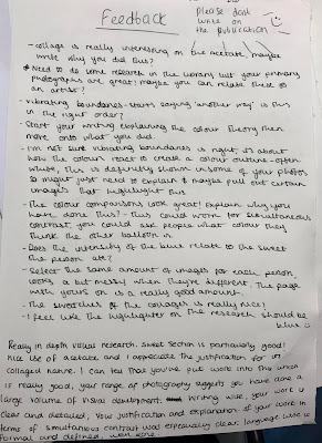
Throughout the group Critique, the feedback that I received was mainly positive. There were a few comments on how my publication could improve and ideas that I could try out in my next stages.
General feedback:
- The collages for Contrast of Saturation were interesting when photocopied onto acetate, write about why I did this; This was to show the collages developed using different media except from paper, also to show how the collages looked overlapped and repeated.
- The colour comparisons look great, explain why I have done this- this could work for Simultaneous Contrast, I could ask people what colour they think the other balloon is; I like the idea of asking other people, certain people may think its more of a red shade or more of an orange shade, create a poll?
- The contact sheet page for Simultaneous Contrast using my photographs works best out of all the contact sheets in terms of layout
- The swatches from the abstract collages are really nice
- Really in depth visual research
- The sweets idea is particularly good (Simultaneous Contrast)
- Appreciation of the justification of the use of acetate in terms of the collaged nature; I appreciate this comment, the acetate shows collage as well as they include layering
- It is clear that I put work into this which is really good
- My range of photography suggests that I have done a large volume of visual development; Thank you, in future projects I will look more into photography as I have enjoyed exploring it through this brief.
- Writing wise, my work is clear and detailed
- My justification and explanation of my work in the Simultaneous Contrast was especially clear
- Language wise, my publication is formal and defined
- Great photos- how could I push them further; Use different cameras, canons, disposables, different phone qualities etc.
- Really likes the Simultaneous Contrast idea, its very playful and works really well
- The writing is really clear and explanatory
- The colour comparison is really interesting; I particularly enjoyed the comparisons between the Turquoise and orange too
- The collages printed onto the acetate are really effective, really likes the imagery and the different themes of each image; Thank you, the shapes and patterns were inspired by actual shape from the Turquoise rock.
Areas to improve/things to try out:
- Use other printing methods and materials; This is a good suggestion, I have mainly only printed onto white colour paper along with two acetate sheets, I will experiment with colour paper, newsprint and tracing paper for different textures and effects
- Need to do more research in the library; I will collect some books relating to photography and colour to develop and inspire my work further
- Start my writing explaining the colour theory first then more onto what I did; For the Vibrating Boundaries I had to start of by talking about the experiment first as it changed from the colour theory of Light-Dark Contrast to Vibrating Boundaries
- For the Vibrating Boundaries I need to talk more about how colours react to the outline- pull out the photographs that highlight this; I will experiment with the idea of outline colour with the photographs that represent this best
- The highlighter on the research should be blue; I agree with this, I only had pink at the time


No comments:
Post a Comment