Monday 26 February 2018

26 Characters Research

In order to begin taking some interesting objects using my 5 objects, I have begun to research some artists/photographers that interest me. One particular art account on Instagram that I have been inspired by for a while now is @iamblueiampink, the account consists of art direction, set design and photography.

The name 'iamblueiampink' comes from the colour scheme of pink and blue that runs throughout their work which I find interesting, as well as the extremely unique, quirky and weird set designs that they create. A key reason why their set designs have such a quirky feel to them is because they often use weird objects/textures with a lot of character; animal ornaments, poured alcohol, dolls and toys, snazzy accessories, smoke, spilt liquid etc.

In the photographs, a lot of the objects are often floating in the air, or balanced in really weird ways. I'd like to experiment with this style as it creates a sort of magical, fantasy aesthetic, in order to create photographs in this way I'd need to edit thoroughly or maybe tie my objects with string. I will also play on the idea of a limited colour palette in some of my photographs in the same way they do (blue and pink), I will select colours that appear consistently throughout my 5 objects, as well as experimenting will singular colour and black and white.


Sunday 25 February 2018

Publication 2 Starting Point; 26 Characters

The second publication is based on 5 objects that have some importance to me. I then have to photograph these 5 objects in 26 different ways; situations/compositions/arrangements/still lives. Every composition/photograph must contain all 5 objects. In each photograph, I need to establish some narrative in them, tell a story, or think of an interesting sequence. The publication can't contain any typography except from the title, the title needs to be some snappy and simple.

The 5 objects that I took in were; my panda teddy that I bought when visiting Edinburgh Zoo (especially for the pandas) as pandas are my favourite animals, my favourite eyeshadow palette as I have always had a huge interest in makeup (it is part of my daily routine), my film camera that I have had for a while as I really enjoy using it as I find it really exciting getting my photographs developed, fourthly I took my Nicki Minaj perfume that I have had since I was 14 when she was my favourite artist, and lastly I took a polaroid photograph from my 18th birthday as it was one of my favourite days.

I have begun to think about concepts and ideas to experiment with for each photograph;

  • What is an object?
  • Could I cut out a silhouette of the object?
  • Can the objects be combined/joined together?
  • Could I create a sculpture? Look at set designers that I like; @littledrill and @iamblueiampink
  • Maybe think about colour palettes that I could use; the black and white from my panda combined with Nicki Minaj pink hair from the perfume bottle 
  • Could I collage 2 photographs together to create a new photograph? I love collage so I would find this a really fun technique
  • Scan in the physical objects
  • Play with scale; since the panda is big and the polaroid is small, could I photoshop the panda to look tiny and make the polaroid huge, this contrast would look interesting
  • Experiment with order and hierarchy; tallest to smallest, most fun to most boring, most special to least special, brightest to dullest


In the afternoon we got set a task to take one of our photographs to display at the end of the day. For my photograph, I played on the idea of taking the photograph of my 5 objects in the mirror of my eyeshadow palette (which was one of my objects) I thought this was interesting as the eyeshadow palette and colours were still visible in the photograph/mirror as well as the other objects. It was also interesting to see other peoples photographs.


Friday 23 February 2018

Poster Critique

Today I had a critique of my final (almost) poster, I wasn't sure if I'll actually use this design as my actual final A2 poster so I showed a few other developments too to see if people preferred certain elements from them instead. However, this is my favourite design that I have created so I used this as my final, I will continue to develop this as my final design whilst making a few tweaks to it based on the feedback I received today. I also asked people if they preferred the design with or without the design more.

I received mainly positive feedback throughout the critique, and I mainly agreed with the areas that people said I needed to improve on;

  • Rationale is reasoned and worded really nicely
  • Final design is lovely and fluent, it works best without the cross word grid which seems a bit restrictive
  • Maybe try using different type sizes to create a visual hierarchy, showing what information is most important first
  • Perhaps when the design is finished, print it on quite textured paper to match the quiet, chaotic feel I have here
  • One person preferred the black background; the black text is hard to read over the drawing where the text is a lot clearer to see in white, also with the black background the drawing stands out more
  • Could be nice printed on matte paper stock with the design (illustration) in gloss making it jump more from the page
  • Make each piece of text more distinctive with scale e.g. title should be larger than the rest to provide a sensible hierarchy of information
  • The imagery is successful on giving an impression of music and rhythm. 
  • Make the text a little bit more ledgible
  • Crossword typography does have order, but this is good as it provides a nice contrast to the imagery below it
  • How would more vibrant colours look?
  • Rationale is very good and explains the design very well
  • The typography and the placement of the text works really well, the text works better on the posters with the white background (without grid)
  • The imagery is very successful, the colours are strong and bold
  • To develop, I could try and have some of my typography in different sizes to create a visual hierarchy 
  • Loves the look of how in the illustration when the lines overlap, you can see the change of colour
  • Concept is great and it definitely pushes poster boundaries
  • Prefers without the grid; it could work if I had it really faded in the background or printed my poster onto some sort of graph paper (the blue would work really well)
  • The type works really well, like a crossword, it is puzzling but displays the information in a unique way whilst still being very readable


Final poster after making final adjustments and changes based on feedback:


Thursday 22 February 2018

Publication 1: Fanzine Group Publication

From the fanzines that we each created in groups of 8, we had to choose the best one to develop into a final publication and reproduce. However, there wasn't one specific booklet that worked extremely well; specific pages from particular booklets stood out. We all displayed our booklets to each other so we could see if there were any re-occurring themes; we noticed that collaged faces were a common theme, especially in Jakes booklet. The idea of faces was intriguing as the faces were all collaged in weird ways, drawn over and ripped up.

One of the faces had a tracing paper flap that was stuck on top with a silly face drawn over using marker pen, we found this idea interesting as it has a childlike theme as well as being quirky. To develop the publication we will use this tracing paper flap technique over each collaged face on each page. We have now photocopied the faces we want to use and put the pages in the order that we like. The final publication will have one image per page in colour.


Some of my favourite pages;


Publication 1: Fanzine

Today we started the first publication; a fanzine. The task was to work in groups of 8 to each create a publication of 12 pages (folding 6 pieces of A4 paper).

The first publication task was split into 2 separate tasks; the first task was to create a collage or a graphic intervention and then pass it to your left for the next person to do. As the booklet was passed around each time, you had to follow a common theme used in the last intervention. I found this task fun and interesting as you could see how each persons working aesthetic was different to the last persons, some of the pages were really abstract, while some were very collaged and busy. When creating interventions on based on the previous page, I often focused on a particular piece of imagery that I found interesting, or the colours that were previously used.

The second task was to create an intervention on each page purely using letraset to add typography and language to the collages. The same technique of passing the booklet round each time was used, but this time we passed to our right. Pat gave us a word to focus on for each intervention when passing the booklet around; reduce, collide, scramble etc. I really enjoyed using letraset as I felt that it gave the pieces more personality and quirkiness, some of the language used was also interesting and humorous.

If I was working alone, I think I would have worked purely collage based using just imagery from magazines. Where as working in a group, I was more experimental with drawing on top of the collages using marker pens and ink, I found it interesting when other people were using this method. I also wouldn't have ripped pages and cut through the papers before sticking them down.

I limited myself by often using imagery from magazines which contain people, models or patterns in clothing as I had a lot of fashion magazines, I also stuck to one or two colours when drawing on top of collages. Furthermore, a common theme that ran through my publication was the use of abstract shapes, also the colour green was used on every page which I found interesting.


Monday 19 February 2018

Cell Phone Symphony Poster Development

I have begun to develop my chosen poster out of the 6 initial posters that I created.  Based on feedback from critique group and Ben, the design that I've chosen to develop further is the poster that was based on a drawing music task (the first image). The illustration was created when listening to a song, the notes and rhythm were drawn by hand using marker pens in an abstract and experimental way. This process was repeated 5 times using the same song, I chose to use the most wacky but pattern based design out of the 5. I think the idea of drawing from music links well with the Cell Phone Symphony concept as it also follows the idea of creating musical sounds using technology.

For poster 2, I used the original poster illustration and put it into concept in a social media layout; Twitter. I placed the illustration as if I was going to post it as a tweet. I edited the information on the page to have concert information on instead, e.g. ‘Location; 46 New Briggate’ , ‘Whos in this photo? Golan Levin’. The drawing symbols were taken from the Instagram drawing symbols that are displayed when uploading a story to your page.

Im not really a fan of development 3 as the composition and an overall layout doesn't work as well in a square grid. I used handwritten text to match the hand drawn illustration, however I think it makes it too busy when combined with the handwritten text as there is too much going on at once. However, I developed the idea of using a square grid poster 4 and onwards, this particular grid works a lot better as the squares are smaller which gives a more simplistic look. Poster 4 uses the idea of displaying the Cell Phone Symphony information as a cross word using a square Microsoft Excel grid. I think that grid gives the overall design a more digital look, creating contrast with the drawing. Figure 4 follows the idea of using an extremely enlarged version of the illustration as the background image with different sized squares of the illustration ontop

In posters 5,6,7 and 8, the idea of the Excel grid has been used each time but in a different way. Figure 5 and 6 are very similar as they both use the grid in the same way, as well as typography. Figure 6 also uses the Excel crossword and an enlarged image of the illustration as the background image. However, I used the shapes found in the enlarged background image to place smaller imagery of the illustration inside. Furthermore, figures 7 and 8 experiment more with scale within the crossword typography. Design 7 is similar to design 4, except another enlarged layer copy of the cross word type is added on top.

For poster 8 I also experimented with the scale of the typography by enlarging singular letters within the original crossword and then duplicating the layer 3 times to create a more digital glitchy effect. For some of the designs, I chose to remove the grid lines to exaggerate the crossword typography. Where as the designs that use the grid lines gives more of a digital effect.


Friday 16 February 2018

Book Binding Workshop

Today I had my book binding workshop in a small group of 6. We were taught how to make three types of book; pamphlet stitched, stab bound and concertina. I found the workshop extremely fun while at the same time quite relaxing, I really enjoyed the process of creating each book. I thought each process was simple and easy, however I found the concertina method the hardest.

The first book binding method that we did was the pamphlet stitch, which I found the easiest. When creating the pamphlet book, we were also taught how to use a bone folder to create neater creases than using just your hands to crease. Furthermore, we used a sample sheet to create to create our measurements on where to create the stitch holes; one in the middle and then 2 more (half way between the middle mark and the top and bottom). This method would be useful for binding a small zine for example, instead of a book with loads of pages as the stitching would be too difficult for a thicker book.

The second book binding method was the stab bound, this method was my favourite as I enjoy stitching in general, it involved the most stitching out of the 3 methods. I also just liked the way it looked in the end; handmade, textiles-y aesthetic. This method involved the most measurements/stitch holes (5 in total), also when stitching it was important to remember to not retrace your steps as thats where the pattern can go wrong. However, no folding was required for this method which I actually preferred because it was neater and folding can often go wrong and need trimming.

The last method we learnt was the concertina, this took the longest as there is more steps and we actually made the hardcovers ourselves using grey board and special book binding paper. This method involved no stitching, just folding and glueing, I prefer to stitch as it gives me a neater result that glueing, its also messier. However, in my opinion this method looks the most professional and sleek when its finished, I think it'd be useful if thats the type of publication aesthetic you're aiming for. I also think the concertina method is the most fun when done because of the way its opened and viewed; double sided like an accordion.


These are some of the sample books that were displayed for us to look at in the end and maybe try out in the future if we wanted. These were my 4 favourites.


Friday 2 February 2018

Final Zine (Pussy Power- Vogue) (Steve Hockett workshop part 2)

This is what the final zine looked like, we thought of calling it 'Pussy Power' as it represents the idea of the cats being the glamorous vogue models, as well as being humorous and fun. I think the final zine was extremely creative and fun; I loved the whole idea of collaging the cats on the models, I think the combination of paper worked really well too (thin newspaper, normal white paper, coloured paper, and sugar paper) and the photocopy experiments worked really well throughout the zine too; duplicating the same image, zooming, shrinking and using single colour.

I really enjoyed making this zine and I feel that this was clear to see through the aesthetic of it as it is fun, vibrant and a little bit weird. Working with my friend Jake was really fun as well as I felt that our ways of working combined together worked successfully, we both have an interest in fashion as well so the idea of using Vogue magazines to collage was an exciting task for both of us.

 I also think we managed our time well; 15 minutes to generate ideas and gather material, one hour and 15 minutes to photocopy and half an hour to put the zine together.


This is one of my favourite zines that someone else created; 'The story of the happy fluffy bunny'. Each drawing tells a different story of how the bunny evolves/gets through his day, this was an extremely effective and funny way to illustrate these drawings, e.g. one of the pages was when the bunny turned into a cow. I really liked the limited colour palette used as well; white, blue, and magenta.


Wonder Room Studio (Steve Hockett workshop part 1)

Today we had a workshop with the graphic designer, publisher and artist Steve Hockett; Wonder Room Studio. His work mainly consists of various media including printed matter, illustration, motion graphics and creative/art direction. He likes to create work in non-traditional graphic design techniques, Risograph print is one of the main ways that has work has changed and been influenced, he has been using this method for around 8-10 years.

"Rad Bad" when something is so bad its good- Steve Hockett. He is particularly interested in using methods of production to produce error.

When he first graduated, he used a simple technique of using black text, with an overlay of colour, with a different coloured background, I think this aesthetic is fun as well as simplistic. He also likes to work quite illustrative, as well as spray painting.

In the morning, we got set an extremely fun task in groups of around 10. The task was to each draw a brand logo using black marker pen and then pass the drawing to your left for the next person to draw, the process was repeated 10 times. The logo that I drew was the Apple logo. As the drawings were passed around, they started to get more and more distorted and some were even unrecognisable by the end. The next exercise was using the same technique but this time we had to draw our 'spirit animal', of course mine was a cat as i'm obsessed with them. However, this time around the time for each drawing got shorter and shorter making the drawings look more rushed and a little bit crazy. The end drawings for both processes were extremely humorous because of how different drawing 1 was from drawing 10. The process of these two tasks was really fun and I'd enjoy doing tasks like this to create future work.


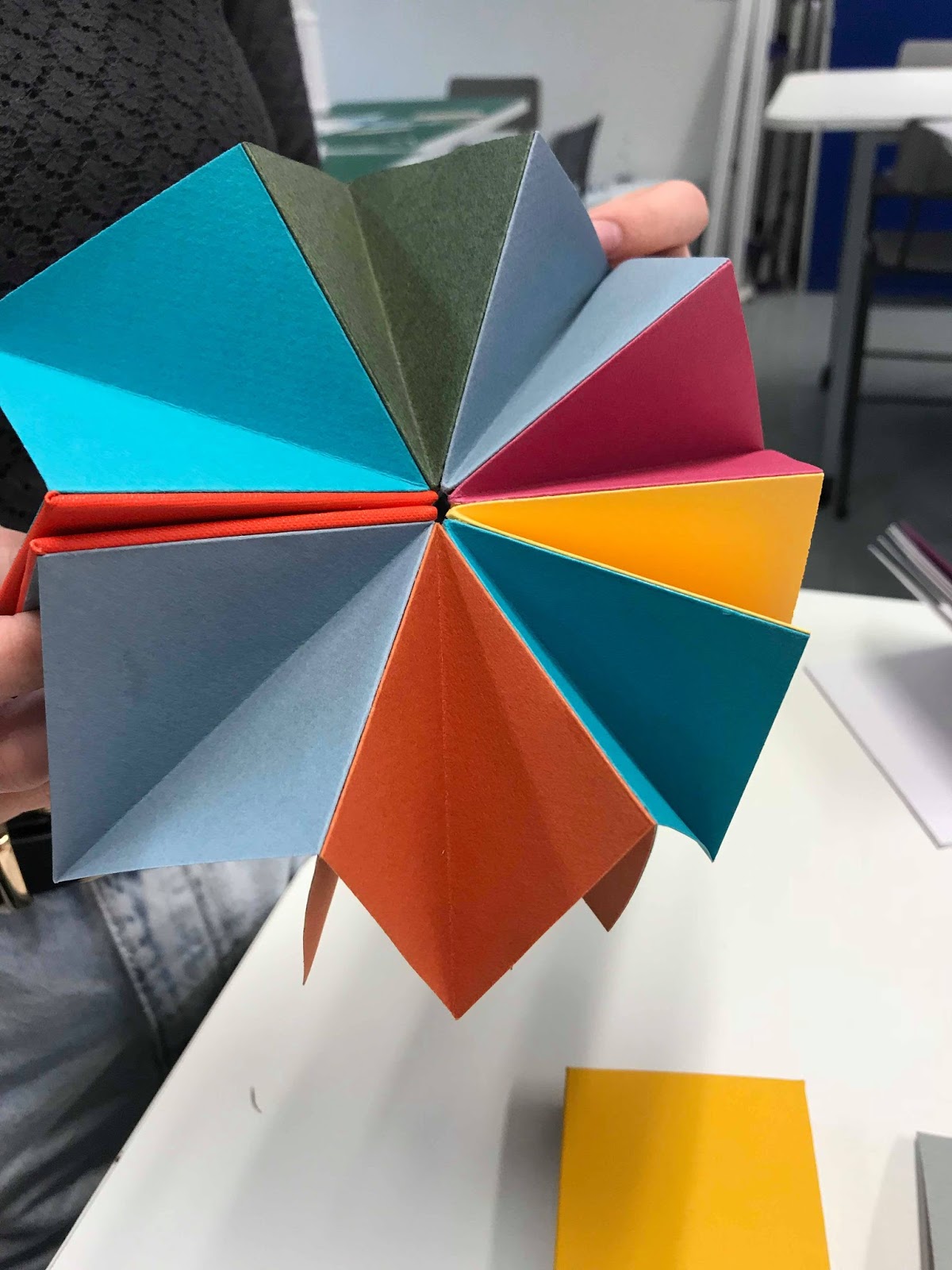
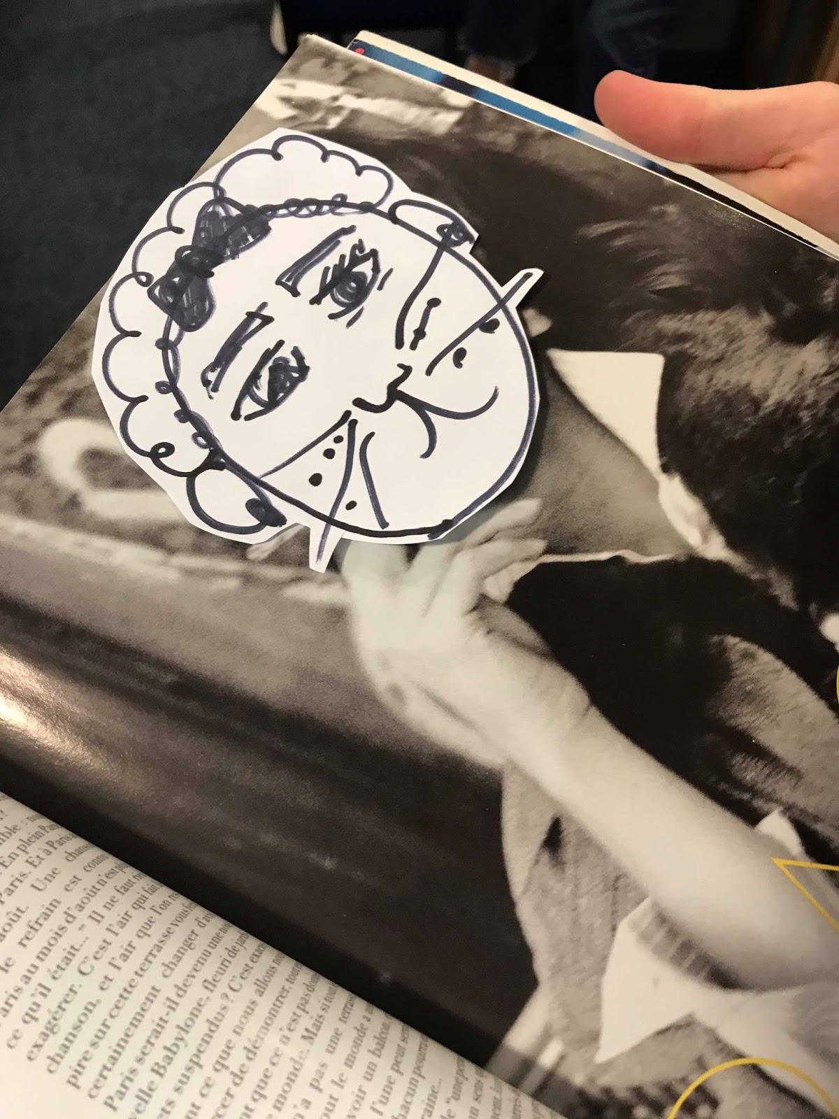
After lunch, we were set the task to make zines using the drawings that we created (in 2 hours) in pairs. Mine and Jakes initial idea was to use my cat drawings to create a fashion magazine, as each drawing had a new accessory which we found humorous and felt that we could experiment a lot with this concept in terms of layout, collage and colour.


We begun to photocopy and cut out the cat heads and then placed them over vogue magazine pages to generate the funniest imagery to use. We found this process really fun, it was also interesting how certain cat heads work only look good on certain model bodies.