1. The most popular words in Escape Room song titles comprise a healthy mix of expletives (f*ck, b*tch), festive/religious allusions (party, power, holy) and ambiguous instrumental terms (interlude, outro, untitled, remix).
2. The genre is explicitly defined by patterns in Spotify's user data
3. Spotify further classifies Escape Room into a three-tier algorithmic playlist system: The Sound of Escape Room, The Pulse of Escape Room (“the music that serious Escape Room listeners play”) and The Edge of Escape Room (“mostly unknown music that serious Escape Room listeners have discovered”).
4. Escape Room sits in the 70th to 91st percentile for modernity
5. The genre Escape Room can’t be tied down to any particular geographic location, implying a more or less universal appeal.
Sunday, 25 March 2018
Chosen Micro-Genre; Escape Room (OLD)
http://everynoise.com/engenremap.html
When researching and listening to a range of different micro-genres on the website everynoise.com, I discovered loads of interesting genres that I'd never heard of before. The genres that interested me most at first glimpse of the website included; hip-hop, disco, old school hip-hop, r&B, urban contemporary and indie.
I think that the main music genre that I listen to is deep indie r&b; I wanted to find something that related to this micro-genre, whilst at the same time being different and intriguing. I really enjoy discovering new music in my spare time which is why I enjoyed this task so much. After spending the day listening to new genres from everynoise.com, the micro-genre that I have decided to base my brief on is Escape Room;

I found this micro-genre extremely interesting as after listening to a bunch of these artists, I noticed that the genre is very wide-spread, whilst at the same time remaining a link throughout. The micro-genre also really interested me as the mind map displayed some artists that I already love; Anderson Paak, The Internet, KAYTRANADA, NxWorries and Solange, their genres include hip-hop, rap, soul, funk and dance.
Ranked list of the 20 genres that are most similar to Escape Room;

Furthermore, the micro-genre Escape Room was described an interactive “scatter-plot of the musical genre-space” developed by Glenn McDonald, a Data Alchemist at Spotify (via The Echo Nest). Every Noise maps all of Spotify’s genres and their [dis]similarities by pulling from the Echo Nest API, which characterizes every song uniquely along 10 internal indicators, including tempo, loudness, danceability and emotional positivity.
The genre is explicitly defined by patterns in Spotify's user data. "This is one where the genre comes from collective listening patterns..."- McDonald
According to Every Noise, Escape Room currently ranks #107 out of 1,482 in popularity on Spotify, placing it snugly in between crunk and punk. On a granular level, Escape Room also sits in the 70th to 91st percentile for modernity (#434), femininity (#327), emergence (#260) and youthfulness (#126). After listening to the Escape Room spotify playlists, I have already discovered so many songs that I enjoy, I have begun to list all of the songs that I like in order to later narrow it down to a playlist and create something that I also personally enjoy.
Saturday, 17 March 2018
End of Module Evaluation 405
Overall, I have found this module one of the most enjoyable modules at university so far. I really enjoyed the briefs that were set as they involved a lot of experimentation as it was all about the process of creating a design. I liked that it was all about the process of creating a design, not just about how the design looks in the end and the meaning. I noticed that when doing the set briefs for this module, I tend to research and create physical work both at the same time, rather than to research first and then start creating. I find that doing physical work simultaneously keeps me more motivated and experimental the whole way through the brief.
I found the second brief easier and more enjoyable than the first brief. I found the Cell Phone Symphony brief more challenging than the publication brief because it followed an extremely digital aesthetic of working, I prefer to use methods such as collage and mark making, however I felt that those methods weren't appropriate for the brief. Also because the brief was less than a week long I felt that I didn't have enough time to experiment as much as I'd like, I experimented with a few themes quickly and then just chose the most successful one to develop for my final poster design. However, I did enjoy the tasks that were set on the first day; texting my text door neighbour and working in a group to create designs using our phones.
Furthermore, I enjoyed the second brief a lot more as I was able to experiment with loads of different techniques for each publication. I felt that I could use the methods that I personally enjoyed rather than working just digitally. I also think my ideas changed a lot throughout this brief; at first I was planning on taking forward the 26 characters publication as my final publication but after the group critique with Ben we decided that it would be best for me to take forward the Fanzine Factory publication and develop it in an identity zine. I feel that this was 100% the right decision as it matched my working aesthetic a lot more (collaging, mark making, combing different techniques, vibrant and wacky designs) which is why the final outcome was successful; I really enjoyed making the zine. I was also able to research into loads of new and different designers, as well as my favourite ones.
In conclusion, I think that this module has been really useful as I learnt loads of new things which include 3 different book binding methods, photography skills and effects and the importance of certain paper stocks for different publications as well as size consideration. I also did workshop outside of studio time where I was taught how to use the laser cutter, I found the workshop really fun and would definitely like to experiment with it for the next module if its relevant. I will definitely take forward the skills that I have learnt in this module, as well as signing up to more workshops so that I have loads of ideas for experimentation when starting a brief.
Thursday, 15 March 2018
Final Identity Zine
This is my final Identity zine, I am extremely happy with the outcome; the theme of identity has been successfully communicated through the use of bold imagery, funky collages, mark making and typography. The final publication was printed onto cartridge paper in A5; I used cartridge paper as I really liked the quality of it as it was thick and crisp, giving the overall zine a professional, clean look. The zine was made in A5 as I think zines work best in A5, the size also matched the collage aesthetic best.
Furthermore, the final publication was first tested in black and white so that I could arrange a page order that I was happy with, also so that I could make sure it printed right. The publication was bound using the pamphlet method, I used a cream coloured thread to match the cream on the middle page where it'd be visible.


Furthermore, the final publication was first tested in black and white so that I could arrange a page order that I was happy with, also so that I could make sure it printed right. The publication was bound using the pamphlet method, I used a cream coloured thread to match the cream on the middle page where it'd be visible.


Final Publication Critique
Today I had my final critique of my final publication, I was really happy with all the feedback that I received as it was mainly positive, the areas to improve on mainly suggested trying gloss paper for paper stock, however a lot of the feedback suggested that the choice of cartridge paper worked well with the collage technique; giving it a more professional look, as well as making the text easier to read. The final zine was printed in A5 colour and bound using a stab stitch method.
As a whole, I think the identity zine design is extremely successful and experimental in terms of communicating the idea of identity through different topics which include gender, race, fashion and sexuality. As well as communicating the idea successfully visually through a wide range of experimentation using collage and illustration. The zine has a consistent structure and vibrant aesthetic to it throughout; reflecting on the idea of everyone having a different identity, every page is experimental, wacky and different. I really enjoyed creating this zine as I was able to use all of my favourite techniques throughout; my working aesthetic is very collage-y, illustrative, busy and bright, I feel that the concept really suited the methods I used.
Positive feedback;
- The theme of the publication works well with the chosen of collage. The colours and interesting way of generating new imagery are very engaging to the viewer
- The text harmonises well with the imagery
- The final outcome is successful but has other paper stock been experimented with? possibly coloured paper? Yes I experimented with coloured paper when developing from a fanzine factory publication to an identity zine, I found that as my collages were very bright, the colours clashed too much and weren't as clear on coloured paper.
- The theme is communicated well- strong sense of 'identity' has been created through collage
- Really nice paper stock- works well with collage technique- looks professional
- Similarity to ID Magazine
- Really like the fact it looks like a professional zine
- Really like the use of collage
- Text and images work really well together
- Colour palette is strong and eye catching
- Contrasting content and pages works in some cases
- The paper is thick which at first was found quite challenging to flip the pages, although afterwards it was found that the thickness works in my favour making; it easier to read. I agree with this, I think if I had more pages it'd become harder to flip but it worked well with the amount of pages I had
- Good binding skills; almost didn't notice the thread
- Love how far the publication has been refined since the group project. Really expressed the point with how the publication has been designed
- Its sick- doesn't need changing
- Paper stock works well
- Collages are really interesting to look at, and could tell what the book was about without an info page
- Strong use of colour- matches theme well as bright colours are used in the pride flag. I really like this comment as I hadn't even realised that it matched the pride flag!
- Good choice of text- matches the zine well- good story
- Mark making on top works really well- creates a contrast
Areas that could be improved/considered;
- At first understanding the meaning was quite challenging; as the pages are very full on, once the text was read through, it started to become clearer. The pages are very full on and wacky to communicate the idea of everyones identity being different and being able to express yourself.
- Why is some of it hand drawn and not just collage?; To create contrast between the collages and because I wanted to make the pages as fun as possible.
- Could gloss paper be used? As most magazines are gloss. I think the front cover could look good in gloss but not the whole way through; most of the other comments mentioned that the paper stock (cartridge) worked well.
- Potentially make the zine larger than A5, was A4 or A3 tried? I didn't want to do A4 as it is too basic, most publications are A4, although A3 could look interesting, but then the collages wouldn't look as nice on a bigger scale.
- Could the links on the back be incorporated into each page instead? This is a good point, but that would mean repeating the same link of different pages as used the same articles on different pages
Monday, 12 March 2018
Developing Previous Collages
As well as creating new collages to use within my identity publication, I have re-used and edited some of the collages from the original Fanzine Factory publication; my favourite ones that I think communicate the idea of identity best. These are examples of 2 double pages spreads which use the original Fanzine collages compared with the new edited versions that I have created.


For this double page spread, I have used both of the original collages as they are and experimented more with adding some language and mark making. The mark making/doodles on the left collage are inspired by the doodles on the collage on the right; linking the two together. I have also added some text that I edited myself underneath the first image to create the idea of a bio about the man in the collage; suggesting something about his identity.


This double page spread has been developed further than the previous one. I have only used the collage on the right combined with one of the new collages that I have created, I think both collages work really well together in terms of colour and layout. I have also added more text into this page from articles about identity. Furthermore, the little mark making and doodles work really well with the photographs. The photographs have been cut up and re-arranged.
Friday, 9 March 2018
Final Identity Zine Research
As I am developing the Fanzine Factory Publication into an Identity zine, I have begun to research into some collage artists that I find interesting, which will give me some ideas on how to push my collage skills further when creating new and more abstract/experimental collages. I have researched into the work of OOMK and Mat Maitland.
One of My Kind (OOMK) is a collaborative publishing practice led by Rose Nordin, Sofia Niazi and Heiba Lamara. They make, publish and distribute books and printed works from self-initiated projects. Their publications have a highly visual, handcrafted, collaged and vibrant aeshetic. Their publications are based on the imaginations, creativity and spirituality of women. Each issue is based on a different creative theme, with more general content exploring topics of faith, activism and identity. I love the way combine bold colour with pastel colours, I will consider contrasting colours when collaging and editing the imagery that I create. I also like how they place an image/collage with text; fitting it around the image and having it small and simplistic against a big, bold image.
The work by OOMK was relevant in terms of how to communicate the idea of identity through collage and imagery, where as Mat Maitlands work influenced the Identity Zine when thinking about composition, the abstractness of the collages, colour and choice of imagery.


Mat Maitland is a collage artist, he is famous for his surrealist-pop images and films which have been commissioned including Louis Vuitton, Kenzo, Hunter, Tate Gallery, MAC Cosmetics, Nike and more. I love the digital and crisp aesthetic of his collages, it gives the collages more of a rich and sleek style compared to handmade collage which is more rough and playful. I will experiment with creating digital collages in a similar way as at the moment all my collages are handmade.
"Mat pulls off one of the most difficult image-making tricks around, and what’s more he makes it look easy. There’s an awful lot of surrealist collage and far too often it feels like it’s trying too hard, but Mat knows exactly what works and what doesn’t and just as importantly he knows when to stop. So it’s no surprise that big-name clients are beating a path to his door.” (It’s Nice That)


Developing Publication; New Collages
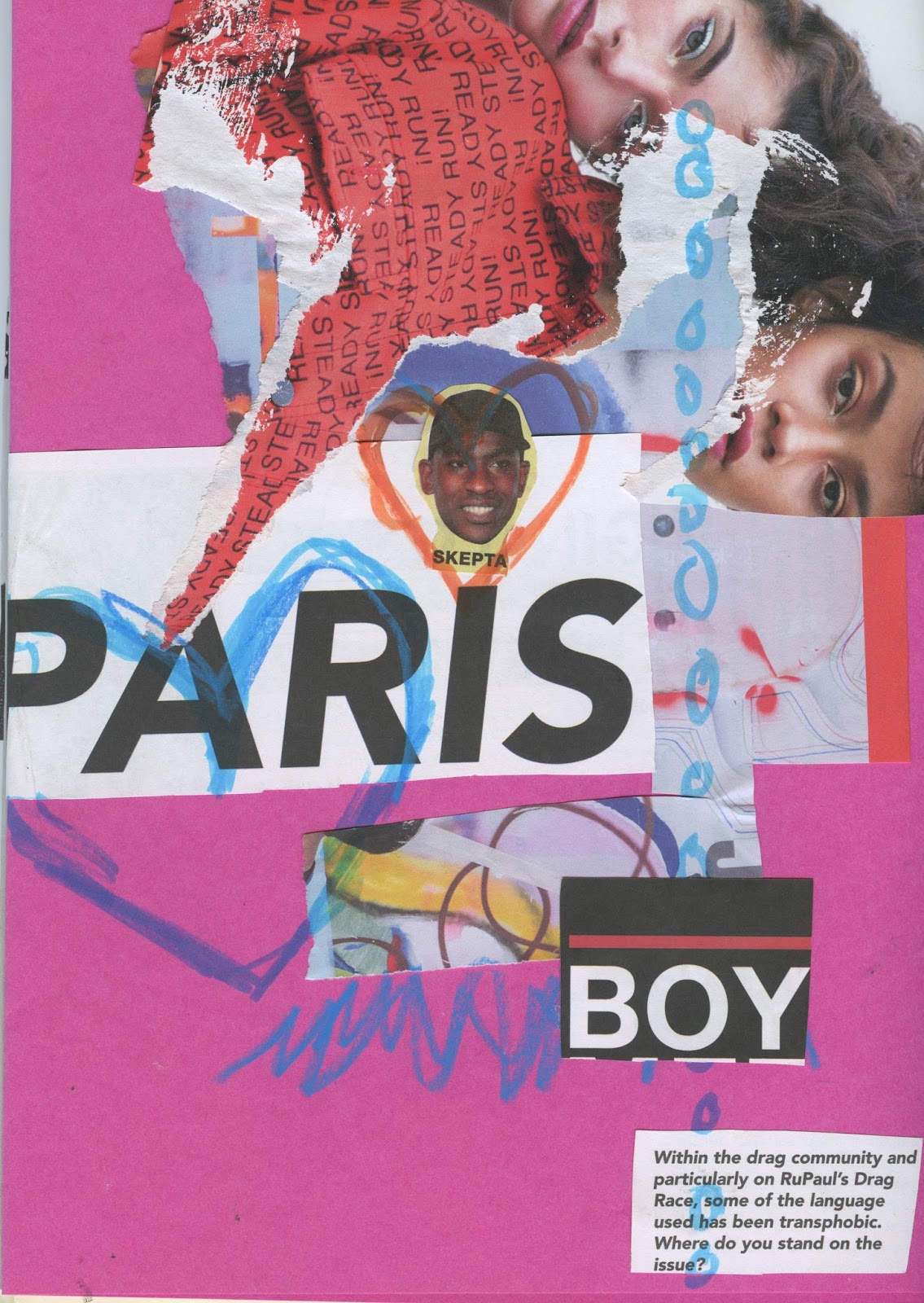
In order to develop my publication from a Fanzine Factory publication based on faces into a zine based on Identity. I have begun to create some new collages which communicate the idea of identity and gender more through using imagery of people with different facial expressions, drag queens, collaging two faces together, celebrities, couples, younger people, fashion, models etc.
I have also started to collage text and language that I found in magazines/articles about drag and identity. Furthermore, I have started to collage different words together to spell out sentences which communicate ideas about gender and identity. The use of typography in this way gives the collages a lot more personality and depth, as well as creating a nice contrast between the imagery whilst at the same time sticking with the collaged aesthetic throughout.
To develop my collages even further, I will experiment with creating collages digitally to create a mixture of collage techniques throughout the publication. I think creating collages digitally will also allow me to experiment with a lot more imagery rather than just imagery found in magazines and posters.


Thursday, 8 March 2018
3 Publication Group Critique
Today I had a critique with ben and my crit group in which I explained and presented physical draft versions of each publication in order to gain feedback on which of my publications to develop further and reproduce as my final outcome. I printed the publications in different sizes; A4, A5 and mini (smaller than A6), I also printed them on different paper stocks; normal paper, cartridge paper and coloured card, the stock that I liked most was cartridge.

After explaining my publications to the group, it was suggested that I should take forward the fanzine factory publication; in the critique I displayed it in black and white paper, black and white on coloured paper with tracing paper drawing and on cartridge paper in colour.

In order to develop this publication further, I will continue with the abstract collaged faces theme but as the idea of identity into each of the faces/characters. Ben suggested the idea of creating an identity book, things to think about when creating the publications are; what is identity? how identities are being blurred about in this generation in terms of everyone being the same...or are people becoming more individual and experimental? do people try too hard to fit in? and gender identity.
I was really happy that the faces publication was decided to be the one to take forward as my final publication as I really enjoy collaging and experimental with loads of wacky materials and themes. I also think the identity theme will be really interesting as it is something that relates a lot people of my age and this generation. I think I will call my publication 'Identity' and print is as a normal A5 sized zine as it is most appropriate (it is a little identity zine) but trim it down to be square shaped so its not too boring.
I will now spend this week and next week creating more collages, researching into the 56 facebook genders, reading articles about gender and identity and experimenting with more paper stocks. A particular website that I found really interesting that Ben suggested was OOMK.
Wednesday, 7 March 2018
Uncomfortable Images Publication Development
I have started to create some initial pages for my uncomfortable images publication; based on animal testing. For the front cover I have created a minimal illustration which plays on the idea of animal testing being used for beauty purposes; drawing rabbit ears onto a lipstick. I wanted to keep the cover simple in order to contrast with the huge issue/debate of animal testing.
The pages will be printed A5 onto cartridge paper in colour. I have decided to give each of my 5 uncomfortable images a full page as it will have more of an impact on the reader rather than if they were small and placed on a page next to the text. The order to the publication is image and then text. The text page has chunks of information from the BBC animal experimentation page that I find interesting and relevant. The text page displays a mosaic background which is created from the uncomfortable image before; pairing the image page with the text page.


The pages will be printed A5 onto cartridge paper in colour. I have decided to give each of my 5 uncomfortable images a full page as it will have more of an impact on the reader rather than if they were small and placed on a page next to the text. The order to the publication is image and then text. The text page has chunks of information from the BBC animal experimentation page that I find interesting and relevant. The text page displays a mosaic background which is created from the uncomfortable image before; pairing the image page with the text page.


Animal Testing Research
For the text that I will use in Publication 3, I have researched into different articles which discuss the method/problem of animal testing, I found it interesting that a lot of these articles were debates on whether it is right or wrong to test on animals as I think that it is completely wrong.
It was interesting to read about the reasons why people would be for animal testing compared to why people are against it. I have decided to use one of these debates as the articles/pages for my publication, it takes about how it is ethically wrong to test on animals, but at the same time why people think that it'd be wrong to test on a human and potentially harm them.
'Whatever benefits animal experimentation is thought to hold in store for us, those very same benefits could be obtained through experimenting on humans instead of animals. Indeed, given that problems exist because scientists must extrapolate from animal models to humans, one might think there are good scientific reasons for preferring human subjects' - Justifying Animal Experimentation: The Starting Point, in Why Animal Experimentation Matters: The Use of Animals in Medical Research,
2001
The lack of ethical self-examination is common and generally involves the denial or avoidance of animal suffering, resulting in the dehumanization of researchers and the ethical degradation of their research subjects. - John P. Gluck; Ethics and Behavior, Vol. 1, 1991
The BBC article also talks about a theory based on the three R's; Reduction, Refinement, Replacement. The three Rs are a set of principles that scientists are encouraged to follow in order to reduce the impact of research on animals.
Reduction:
Refinement:
Replacement:


It was interesting to read about the reasons why people would be for animal testing compared to why people are against it. I have decided to use one of these debates as the articles/pages for my publication, it takes about how it is ethically wrong to test on animals, but at the same time why people think that it'd be wrong to test on a human and potentially harm them.
'Whatever benefits animal experimentation is thought to hold in store for us, those very same benefits could be obtained through experimenting on humans instead of animals. Indeed, given that problems exist because scientists must extrapolate from animal models to humans, one might think there are good scientific reasons for preferring human subjects' - Justifying Animal Experimentation: The Starting Point, in Why Animal Experimentation Matters: The Use of Animals in Medical Research,
2001
The lack of ethical self-examination is common and generally involves the denial or avoidance of animal suffering, resulting in the dehumanization of researchers and the ethical degradation of their research subjects. - John P. Gluck; Ethics and Behavior, Vol. 1, 1991
The BBC article also talks about a theory based on the three R's; Reduction, Refinement, Replacement. The three Rs are a set of principles that scientists are encouraged to follow in order to reduce the impact of research on animals.
Reduction:
- Reducing the number of animals used in experiments by:
- Improving experimental techniques
- Improving techniques of data analysis
- Sharing information with other researchers
Refinement:
- Refining the experiment or the way the animals are cared for so as to reduce their suffering by:
- Using less invasive techniques
- Better medical care
- Better living conditions
Replacement:
- Replacing experiments on animals with alternative techniques such as:
- Experimenting on cell cultures instead of whole animals
- Using computer models
- Studying human volunteers
- Using epidemiological studies


Subscribe to:
Comments (Atom)