Wednesday 31 January 2018

Poster Inspiration

In order to create successful and experimental posters designs for the "Cell Phone Symphony" concert, it is important that I familiarise myself with other designers' ways of working with image and type. These are some Instagram accounts that have inspired me and the top 3 posts/posters that I loved from each page.

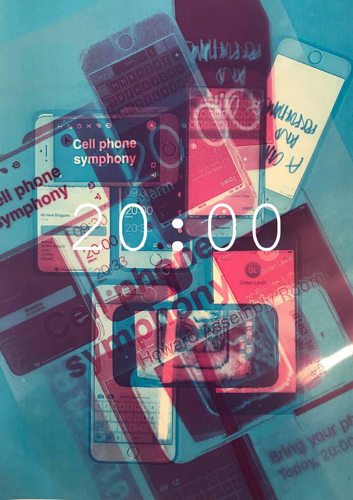
I have made list of things that I like from each poster and things that I will experiment with within my designs. I've also thought about how the designs could be altered.

https://www.instagram.com/swissposters/

1.
-How the yellow bold typography dominates most of the page
-The contrast between the bold, swirly, crazy typography and the neat, neutral, purple type
-The colour scheme (bold colours for type with pastel shades in the background)
-The combination of photography and playful type, the type has a sort of hand drawn aesthetic that I enjoy.

2.
-The combination of photography and flat 2D shape
-The colour scheme; Classic B&W with a bold pop of colour (the pink)
-The placement of the type; incorporating it within the photograph (the mans legs)
-The black swirl shape; bold and effective

3.
-The photograph on its own is extremely strong; great poster even without the type
-The colour palette of the photograph; pastel pinks, soft
-The photograph colours contrast well with the purple type
-The placement of the type around the corners
-Maybe a different typeface? something more bold (its neither light or bold?)


https://www.instagram.com/studiofeixen/

1.
-I love this colour scheme!
-Shot extremely well
-Great angles and composition
-Interesting visual concept
-The type could be more visible and/or bigger?

2.
-This is my favourite piece from this Instagram page; Im in love with the way the purple 'S' dominates and gives the neural newspaper a complete new style
-Bold and jazzy
-Communicates/advertises the Samsung phone in an extremely fun way to make it more appealing
-The big 'S' creates strong contrast with the smaller regular newspaper text

3.
-Instantly eye catching because of the use of bright pop-y colours
-The pop art/cartoony aesthetic works really well
-The overall aesthetic gives the festival a fun, energetic vibe
-Like the idea of fitting the type/letters around the illustration in the middle


1.
-The colours work well against the black background
-It would be interesting to see how more text would work; using the same handwritten type aesthetic
-Like the idea of the illustration dominating most of the page and how it doesn't look like an apple at first glimpse, not obvious!

2.
-These were Raygun magazines from September 1997
-I love the vintage/old aesthetic of these designs, like that its not crisp and clean like most of the work on this page
-The different typefaces contrast really well
-Interesting the that some of the letters have been flipped

3.
-Typography for Warby Parker Holiday Campaign 2017
-Eye catching at first glimpse
-Bright and bold!
-The choice of language 'Wow' works well with the general bold aesthetic
-Good use of complimentary colours
-Would work well a younger audience as well


Monday 29 January 2018

Initial Poster Designs and Feedback

These were my quick poster design that I created today for the "Cell phone symphony" concert. I felt that some designs worked better than others (the second design was my favourite, where I combined singular colours and used acetate to create layers) however, I feel that each poster had an interesting element that could be developed.

I felt that because of the time restriction, my designs weren't as strong as they could have been, however I now have the time to develop the parts that worked best; the use of overlaying, colour schemes (using singular colours), playing around with scale, combining numbers and photographs.

From the silent critique, I received ideas on ways I could switch up my designs as well as questions that suggest ideas for more things to experiment with when developing my designs and questions about my design decisions;

  • Why not work with more distinct type/image hierarchy- e.g. use large, bold typography and less imagery?
  • Why the colour schemes?
  • Create abstract collage/drawing/metaphorical response
  • Don't use mobile phone imagery 
  • Try either with transparency or different colours OR size
  • Try not to hide the title too much
  • Why didn't I think of doing this?! (about the second design)
  • Why only certain colours?
  • Try one colour for whole piece
  • Play with title more
  • Why the type?
  • Why the chosen numbers?
  • Why not overlay letters/text that have been hand rendered?
  • Try a completely different approach
  • Try not to just use the phone photos
  • Make the text more involved in the poster
  • Try black and white


Brief 1 Starting Point

Studio Brief 1 is to design a A2 sized poster based on "Cell Phone Symphony," a performance by the artist Golan Levin, featuring music composed via interaction among the audience's cell phones. The poster must include this information; Cell Phone Symphony, A concert and performance by Golan Levin, Bring your phone! Howard Assembly Room, 46 New Briggate, Leeds LS1 6NU, 8:00PM, 01 June 2018.  The aims of the posters are to suggest auditory experience and ideas of social and technological interaction.

Notes I made while watching an artist video where Golan Levin talks through the mobile phone concert;

  • Its a performance where the audience can get involved through using their phones
  • Love, hate relationship with phones
  • Making music from obnoxious sounds; bells, alarms, buzzers etc. Taking these annoying sounds and turning them into music
  • Short notes to create a kick bass
  • 8000 phone calls in half an hour
  • Random dialling delays

In order to begin designing the posters, we first got set the task to send a text message which described how we were feeling, me and my friends did this in a group chat (blue is me)


With this information, I then had to find a group of people that all felt the same or a similar way to me. This was so that we could team up and use our phones to communicate the concert information. Each phone displayed a different piece of information; the time was shown on the clock app as an alarm, the address was shown in maps, 'Bring your phone' was displayed as a reminder etc.

We then took a photographs and videos so that we could use them within our poster designs if we wanted to. I enjoyed this task. 


In order to design posters that are experimental and fun, I have made a list of variables to consider; colour, typeface, grid system, colour scheme, filters (B&W), scale, composition, saturation, transparency, software, background, pattern, repetition, isolation, distortion, cutting up, collage, length, symbols and opacity.

Another quick task that I did was to note down 10 random numbers. With these 10 random numbers, I put the numbers in order from 0-9 with exact amount, by counting how many of each number there is: 
000000000000000
11111111111111111
2222222222
333333333333
44444
55555555555
6666666666
7777777777777
8
99999999999999

I found it interesting that each number was repeated at least 5 times, but I only used the number 8 once. I also found that the number 1 was used the most (17 times) these are also ideas that I can experiment with.

OUGD405- Studio Brief 1

Studio Brief 1; Making Connections.

Studio Brief 1 is based on Research skills, Idea Generation and Increasing Range of Design Development shown through Design Process.

Design is putting together what we have in order to deliver the values we want. Judgement seeks truth and makes decisions in the past. Design seeks value and designs for the future.”
Edward de Bono. Think! Befoe It’s Too Late (2009)

Edward de Bono is known for lateral thinking; lateral thinking is the idea of not making instant judgement as he believes that it is the enemy of creativity, creative thinking is definitely not limited to special people or special occasions. I agree with him.

Provocative Operation;


6 Methods to generate a PO:
  • Escape: The easiest way to generate a PO; pick something you take for granted and drop it (escape from it) e.g. restaurants with no seats
  • Reversal: Take a normal relationship and reverse it, e.g. the phone rings when I get a call
  • Distortion: Make a change to the normal sequence or change a relationship, e.g. children decide who their parents marry
  • Exaggeration: Exaggerate any one aspect of an initial statement making it somewhat unreasonable, e.g. phone calls can only last 2 minutes
  • Wishful thinking: Make a statement in the form “Wouldn’t it be nice if…”. Should be more than just a desire, e.g. the pencil writes by itself
  • Random word: The thinker chooses a word at random, or a noun from a dictionary, and associates it with the area they are thinking about.

Examples of what this might look like in Graphic Design:


Monday 22 January 2018

Penguin Book Cover Development and Final

I have now started to develop and create my final book cover for the book 'Noughts and Crosses'. The book cover is based on the idea of identity and race; the collaged people have had their faces replaced with bright colours (opposite to normal skin colour) to represent the idea of colour not being important, also playing on the idea that a persons personality traits can be categorised by a colour instead of the colour of their skin.

The colour red is used as the main colour throughout the cover and back page to represent the idea of love and warmth; creating contrast with the theme of racism that runs throughout the book (racism being full of hate and bitterness).

Furthermore, bright colours have also been used to create a childlike effect as the book is from the Children's Cover category, as well as creating contrast with the gloomy black and white photographs. In addition, handwritten text has also been used for the title on the cover; to create a playful aesthetic. The idea of giving the cover a childlike, handmade aesthetic also reflects on the main characters in the book; two young teens. The handmade aesthetic (combination collage and hand writing) throughout the cover works better than if it was all purely digital.


The final book cover:


Saturday 20 January 2018

Penguin Book Cover Ideas

I have now begun to sketch and brain storm ideas for the book 'Noughts and Crosses' for my penguin book cover competition entry. Sketching ideas before working digitally helps as I have a clearer idea of the themes that I can begin experimenting with instead of going straight in.

When brainstorming ideas, I considered the typical design decisions which have been made for the previous book covers for Noughts and Crosses. Typical designs involve a colour palette of red, black and white, the X and the O are always present somewhere, the covers tend to have quite a minimalistic dull aesthetic and everything is usually displayed in a straight line. These are design decisions that I will try to stay away from, in order for my book cover to be unique and different.

Some ideas that I have sketched that could be played on when designing my book cover;

  • The idea of skin colour throughout the cover; use nudes, browns and pinks as previous covers only use black and white
  • Be very experimental with layout! play around with scale using the X and the O. Could attempt a very abstract approach using these shapes.
  • Layering through the use of colour; plays on the idea of race
  • In the book Callum talks about how he has only had orange juice once at Sephys house; his family aren't privileged enough for even the smallest things like orange juice, his family only have milk and water. This could be imagery to play around with...interpret the X and O into illustrations of orange juice and milk somehow??
  • As the previous covers are very minimal and digital, use collage as the main technique to create contrast; a handmade aesthetic to the cover would work well. Collage of people of different race and colours? facial features etc


Friday 19 January 2018

Final Book Covers Critique

Today I presented my final book covers designs in a silent critique; I displayed my Final Outcome design board, my Rationale design board and quick mockups that I printed of my book set to show how they'd look physically. Throughout the critique, the majority of the feedback that I received was really positive which I was pleased with.

Feedback:

  • The imagery created works really well with the contrast of the plain white background works well
  • The handwritten title that I have used within the grid also works really well
  • The concept and idea is presented very well in the finished outcomes
  • Could perhaps try having a block of solid colour that still fits in with the pattern on the back that would maybe make the blurb more legible; This is a good idea, I could have less shapes around the blurb or just have one solid colour behind it but keep the rest the same.
  • Overall, the design is very effective and successful, small details work well such as the type created in Excel.
  • Really liked all the aspects of the design so it was found hard to critique; Thank you!
  • Imagery is successful and relates to the book well
  • Colour palettes for each book are resolved
  • Likes the hand drawn type but not sure it works with the style of the covers; use some type as spine?; Im not sure what is meant by this, whether they're trying to say I should use the handwritten type on the spine instead?
  • Book covers look really good now that the back is completely filled in with squares. Maybe try and place the back text in different squares as well as the barcode; I did try this but I found that the text looked better in one chunk, rather than split into the squares:

  • Try placing squares in background of the cover to tie the front and back together?; I like this idea, I will try this out to see if it looks better
  • What if I didn't have any type on the cover at all? The characters are so recognisable that this could be successful and would create a very minimalistic refined cover; This is a very good point, as I would definitely be able to recognise the books myself without the titles.
  • Maybe one single colour for background of cover, white is a bit too stark, this would also tie in the back and the spine a bit more; I did try this when developing my designs but found that white worked best as colours were clashing with the illustrations.
  • Likes the image that I have created and the idea of pixelating them using purely cells and colour
  • Likes how I related the front cover to the back
  • Is there any way of improving the text; I could play around with scale and composition, with the type of the front I tried to stay within the grid.
  • Strong use of colour works really well- bold and eye catching choice relates well to each book
  • Pixelated book covers work really well- makes the front and back match
  • Strong use of typeface- seems childlike which reflects target audience but also suits the pixelated style- the 2 main fonts contrast
  • Maybe experiment with the layout of the blurb- could it be in the shape of something; Already experimented with breaking up the blurb text, found that it looked best in one chunk
  • Well explained/easy to understand
  • Strong layout- not too busy- simple style is effective
  • Written typography works well over the blocky images
  • Colours are refreshing
  • Why did you want the front and back to contrast? I liked the idea of having a simplistic front as the illustrations are detailed whilst still being pixelated
  • Works well as a consistent set 
  • Really likes the concept of keeping it all in 2D- though the placing of the title doesn't fit as such; I can experiment more with composition
  • Loves the princesses 
  • Nice choice of colours 
  • Barcode needs to be smaller


Cel Animation Research

In order to develop my book covers designs, throughout the critique it was agreed that I needed to focus more on the back cover. The previous back cover with the Excel grid and 4 colour squares looked a little bit too dull; it needed to be more energetic to relate to the childlike theme.

The back cover has now been developed to the point where I am happy with it.  The design of the back cover takes it references from Cel Animation; the original Disney movies were created using this technique. A cel (short for celluloid), is a transparent sheet on which objects are drawn or painted for traditional, hand-drawn animation. The technique was the dominant style of animation in cinema until the development of computer animation.


The idea of cel animation has been used for the back cover through the use of overlaying shapes and colour. Solid block colours have been used for the shapes, as well as overlaying shapes in low opacities over the block colours to create a new colour through transparency.

The idea of the shapes comes from the original Excel characters on the front; I have selected chunks out of each character where I think there is an interesting shape, and then enlarged it and carefully placed it on the back layout.


Thursday 18 January 2018

Final 3 Book Covers Set

These are the final design of these three books covers. I have stuck with the idea of taking the original general animated aesthetic including the characters, and show casing them in the opposite way ; a pixelated 2D illustration, instead of using the colour collage illustrations. Furthermore, I chose choice to use a plain white background and the handwritten typography for the cover as it worked better than any pre-made typefaces and the Excel typography that I created. The handwritten typography is also more playful; sticks to the childlike theme.

All 3 covers follow a consistent colour scheme; sticking with the 4 main colours  that feature in the character illustrations. Furthermore, each book cover uses black for text. The colour of the spine was changed from black to a colour that worked best from each illustration. For the typography for the titles on the spine, I used the Excel typography and changed the colour to black, I think using black for all the text creates consistency and makes the colours pop more.

I have focused thoroughly on creating the background of the back more fun and relevant to the books/movies. To create contrast between the front cover and the back, I have filled the background of the back with of colour and shape, leaving no white space.  The idea behind the shapes comes chunks that have been selected from the illustrations and then made bigger, I thought carefully about composition when doing this. The idea of the overlapping the shapes to create layers and different opacities comes from the concept of the movies being cel animations, this technique was used when animating the movies for each book.

Overall, I am really happy with how my set has turned out, the busier abstract background has had a huge impact on this.


Design Development Crit

Today I had a Critique with Ben and a few peers where I presented the developments of my chosen book cover design, this was useful as I was able to get advice on what needed improving before deciding myself on which design I was going to use as my final set.  I also found it helpful receiving feedback from people that hadn't already seen my ideas as it was completely new to them and I got to hear a range of different opinions.

When presenting my ideas in the critique, I received a list of things to experiment with, I was also told what worked best in terms of background, typography and imagery.

  • The white background looks best on the front
  • Mixed opinions about whether the covers look best with the Excel grid or without, some said with, some said without, personally I prefer without so thats what I will go with
  • Cover needs to say 'Walt Disney Screenplay' instead of 'Walt Disney' 
  • For the back, focus on the idea of more shapes but begin to overlap and change opacities; reference to cel animation as that's how the movies were animated
  • Add the barcode in
  • Change the colour of the spine from black to a brighter colour
  • On the spine, the Excel typography works best
  • Play around with placing the blurb within the shapes on the back, instead of as one chunk of text in the middle, see what works best
  • See how the 'Walt Disney' looks handwritten in the same was as the titles on the front 
  • Keep experimenting with the back; looks too dry at the moment

Wednesday 17 January 2018

Design Development

After the small critique with Pat and a few of my peers, I have begun to experiment with the ideas that were suggested in order to improve and develop my designs. I have experimented with the typography, scale, backgrounds and imagery. When experimenting, I noticed that the subtle changes made a huge impact as well as bigger adjustments that I made to my designs. I think that playing around with ideas has helped to see what works well and what doesn't, I will now try to fit in one last critique of these ideas before developing them into final designs before Friday.

This design has been developed by taking away the original Excel grid lines and keeping a plain white background, I think this works better as I found the grid quite distracting and maybe too busy? The design sticks with the original illustration and the hand written typography for the cover.


For this design, the idea of the Excel grid is exaggerated more as the original grid lines have been kept, as well as creating typography on Excel. I think that the Excel typography works really well on the spine, but not so much on the front cover; it looks too heavy and doesn't separate itself from the illustration, they look like they're one layer using the same grid.


This design explores the abstract collages that I created using colour shapes within the illustrations. I really like how these designs work, I think the collages are extremely strong on their own, as well as enlarged on the back in low opacity. However, I think the handwritten text may be a bit distracting on top of the busy collages.


This design is a combination of some of the elements that work best; the white background with the original illustration and the handwritten text on top, the Excel typography for the spine, and the shapes on the background. However, I think in order to improve my designs, I need to think more carefully about the back; more busy and abstract using shapes, and get rid of the grid.