This design has been developed by taking away the original Excel grid lines and keeping a plain white background, I think this works better as I found the grid quite distracting and maybe too busy? The design sticks with the original illustration and the hand written typography for the cover.


For this design, the idea of the Excel grid is exaggerated more as the original grid lines have been kept, as well as creating typography on Excel. I think that the Excel typography works really well on the spine, but not so much on the front cover; it looks too heavy and doesn't separate itself from the illustration, they look like they're one layer using the same grid.


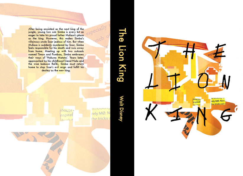
This design explores the abstract collages that I created using colour shapes within the illustrations. I really like how these designs work, I think the collages are extremely strong on their own, as well as enlarged on the back in low opacity. However, I think the handwritten text may be a bit distracting on top of the busy collages.


This design is a combination of some of the elements that work best; the white background with the original illustration and the handwritten text on top, the Excel typography for the spine, and the shapes on the background. However, I think in order to improve my designs, I need to think more carefully about the back; more busy and abstract using shapes, and get rid of the grid.


No comments:
Post a Comment