Tuesday, 30 April 2019

Animated Posters (Final)

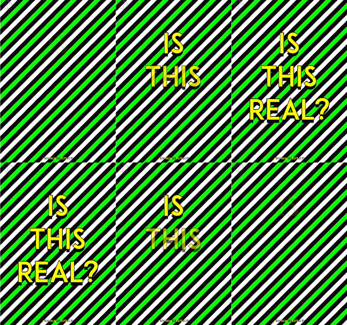
I have now started to animate my posters since they will be viewed on signs and billboards. The issue focuses on social media, so design for screen is very relevant.

I created the animations on After Effects so that they are as seamless and smooth as possible, Photoshop isn't as effective for creating smooth animations. I hadn't had much experience in using After Effects before so practicing was useful in order to learn more about the programme and I really enjoyed experimenting, I will definitely be using After Effects in the future as the animated posters have been a success. The posters will also be printed physically so that they can be put up anywhere.

Furthermore, the size of some of the individual letters from the original posters was decreased in order to increase the readability of them as an animation.

I am extremely happy with how they have all turned out, the animations make the original posters a lot more exciting, eye-catching and engaging which helps my campaign gain maximum exposure. The quirky, seamless and energetic aesthetic of the animations also to my young target audience.


Printing Final Outcomes and Issues

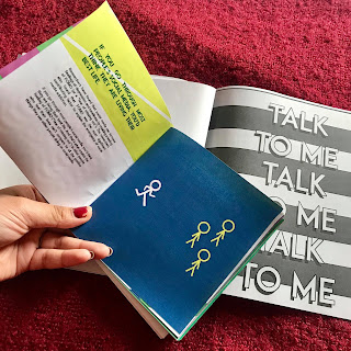
Today I printed my final outcomes in digital print. The final printed publication consists of 11 double page spreads, a glossy cover and an additional belly band cover around the publication. An issue faced when printing the final publication was due to the fact that certain printers in digital print can't print exact neon, only as close as possible as the printers only use CMYK.

The stickers were printed onto matte white sticker paper, whereas the publication cover, belly band and 4 posters were printed onto gloss paper which relates to a phone screen, this was suggested in a peer critique.

Furthermore, the posters and stickers were more accurate to the neon colours on screen as they use a different ink which is more accurate to RGB colours- the publication spreads were printed double sided on Olin Regular 120gsm paper which uses a different printer. However, when the spreads were actually printed the colours weren't as off I'd thought so it isn't a massive issue, obviously if the campaign was actually real the publication would be printed industrially or using a risograph printer in order to get the neon colours spot on.

Photographs of the publication printed:


Monday, 29 April 2019

Further Instagram Development

I have started to develop the Instagram page further following todays feedback. The Instagram aims to communicate the 'dark side' of social media and states the effects of social media through using engaging language and making it personal to the reader by asking them questions throughout the posts. Whereas the aim of the publication is to communicate the message in full depth and inform the audience on the issue whilst providing them help on how to overcome the issue.

The Instagram was changed to use a monochrome theme which relates to the dark side of social media, creating contrast with the publication that uses positive, bold colours as the publication aims to educate, inform the reader of the issues in depth and provide the reader help on how to overcome the issues of social media. The aim of the Instagram page is to promote the publication but not give it all away.

The Instagram bio:

'Are you aware of all the ways social media is affecting you? are you using it to escape from reality? Click the link for help & further info on the issue: SM-Effects.com'.

The link takes you to a page on how to order the publication and find out more about the campaign.

The Instagram posts now use captions that are more engaging and personal to the audience through often writing in second person, using questions and stating heavy statistics. The posts now use minimal illustrations, symbols and language/short quotes instead of pages from the publication, the audience wouldn't buy the publication if snippets of it were already used on the Instagram page.

New, improved Instagram:


Multiple post:


Singular posts:


Publication Tweaks For Tomorrow

I have now started to make the final tweaks to the publication through considering the feedback that I was given in this mornings critique. The Instagram aims to communicate the 'dark side' of social media and mainly states the effects of social media subtly through using engaging language and making it personal to the reader by asking them questions throughout the posts. Whereas the aim of the publication is to communicate the message in full depth and inform the audience on the issue whilst providing them help on how to overcome the issue.

The Instagram uses a monochrome theme (communicating the dark side of social media and stating the issues) whereas the publication uses the original neon, positive colour scheme (aiming to educate, inform and have a positive effect on the reader).

Furthermore, the main feedback for the publication was that it could use two covers: the design of the cover is a filled in heart, whereas a wrap around cover for the publication uses an unfilled heart. This plays on the idea that when you are feeling unfulfilled in real life, you escape to the online version of yourself.

Wrap around cover (what you first see)

Actual cover (the filled heart when you remove the cover)


Below shows the covers in the correct Photoshop dimensions. The wrap around cover is slightly longer than the publication cover so that it is a snug fit around the publication (35cm width), the wrap around cover will work as a belly band.


I also added an additional first page to the publication which uses language that is more personal to the reader through starting with a question, this page. This page uses the same design as the very last page of the publication in order to create a clear link and create consistency.


Final Critique

Today I had a final critique with Dom and a few other peers in which I briefly re-explained my idea and presented what I have designed so far in order to gain some feedback on last little tweaks to make and additional things to consider when moving forward throughout this week.

The critique was useful as I gained some ideas on how I can communicate my message stronger through the outcomes. However, I have a print slot tomorrow so I don't have time to make drastic changes to the publication, however most of the areas that I could develop further were social media/screen related which was convenient and useful, as well being a relief.

Critique comments:

  • Use the Instagram as more of an outline to the campaign and publication- the posts shouldn't all be snippets from the publication because then there's no point in the publication if they can already see it on Instagram. Instead the Instagram could focus more on the fact that social media is an issue and touch on the 'dark side' of social media, then the publication works as the alternative and aims to help overcome the issues- relating to the bold, bright aesthetic of it (negative vs positive). The Instagram aims to promote the campaign and publication.
  • The publication could use two covers: the actual cover is a filled in heart, whereas a wrap around cover for the publication could use an unfilled heart: an empty heart that hasn't been liked. Plays on the idea that when you are feeling unfulfilled in real life, you escape to the online version of yourself.
  • The actual cover for the publication could use a glossy paper stock so it looks like a screen. See what is the glossiest paper stock in digital print.
  • The inside of the publication is all fun, helpful, 'how to break free' and feel fulfilled etc, and making everyone aware of the actual serious effects of social media, aims to educate and help the audience. Whereas the Instagram touches more on the dark side of the issue. This relates back to the cover concept.
  • Multiple Instagram post idea- pic 1 is unfilled heart, pic 2 is filled heart.
  • Wrap around cover and publication spreads use a matte, thin smooth paper stock, whereas the cover uses a glossy paper stock.

Sunday, 28 April 2019

Logo Development

I have now started to develop my logo initial ideas on Illustrator. The ideas and sketches that I decided to develop further focus on mental health and social media through imagery such as faces, mental health symbols and shapes found in a phone.

These ideas are a lot more visually interesting, relevant and successful in communicating my message and issue, peers also agreed with this. perhaps. Furthermore, when developing these designs, I used the same colour palette of 4 neon colours in order to create consistency throughout the campaign design.


I showed the designs above to 2 of my peers and they said that the designs that use a face alongside smaller symbols are the most visually interesting, I also agreed with this so I was glad. This idea focuses on the effects that social media has on our mental health, the cloud communicates the idea that our social media versions aren't real and that they are made up in our heads, and the wifi symbol makes it clear that the issue focuses on social media relating to mental health as well as working as a nice little detail.


Below shoes the final logo and the variations. I felt that the monochrome version worked best as it is the clearest and most effective, a more minimal design also communicates a stronger message as it is more memorable. 

Furthermore, the logo comes in 4 additional variations which use the 4 neon colours from the campaign colour palette. Depending on the neon background colour of the design, the logo outline will be used in the opposite neon colour- the publication also uses this as a rule on certain pages. The monochrome logo will be used as the Instagram icon and on the front of the publication, whereas the colour designs are more relevant to the posters.


Below shows the logo applied to the campaign elements:


Close up of it applied to one of the 4 posters (it is in the same place
and scale on each poster)


Close up of the logo on the introduction page
of the publication

Saturday, 27 April 2019

Logo Initial Ideas

Since I am communicating my message and the issue through a campaign consisting of several final outcomes and elements (publication, posters, stickers and an Instagram page) a logo in needed for the campaign to make it clear that all of these elements are from the same campaign, and in order for the campaign to have a stronger brand image.

Below shoes some sketches and initial ideas for the logo design. These sketches focus on several ideas different ideas:

  • One of the ideas was to use 4 different shapes in the 4 different colours from my colour palette to represent the 4 different areas of the issue. Each area already has an assigned neon colour and each element created heavily uses the 4 colours so maybe the logo also needs to do this in order to create consistency.
  • The other ideas focus on mental health and social media through imagery such as faces, mental health symbols and shapes found in a phone. These designs are a lot more visually interesting and relevant perhaps- these designs could also use the 4 neon colours.
  • The last idea was to use a minimal, memorable symbol that sums up the whole issue- this may be harder to communicate as the issue has several different areas to it...so the symbol would have to be throughly researched and relevant to every area of the issue in order to work as a logo.


When developing the logos digitally, I will ask peers on which sketches they think communicate my message the strongest and which designs are more visually memorable and interesting.


Wednesday, 24 April 2019

Further Cover Development

I have started to develop designs for the cover of my publication further through following critique comments and by looking back at my research.

Critique comments mentioned that the stripe background design was visually interesting but slightly illegible, this design was edited further so that the typography is more legible (Design 4), this design also takes its references from an Instagram post.

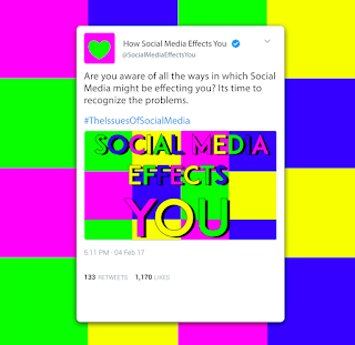
Further, another critique comment mentioned that I could experiment more with different social media layouts and details such as Twitter and Facebook posts. I thought idea was useful and interesting so I created some further designs which focus on the layout of a Tweet and incorporated my designs and campaign information into it (Design 1,2,3).

Design 1 uses a tweet with a simple illustrative background relating back to the illustrations and abstract shapes used in the publication spreads in order to create consistency, this idea follows a more fun and young aesthetic. Whereas designs 2 and 3 focus purely on the layout of a tweet with more emphasis on little details, however Design 1 is visually more interesting.

I asked peers on which designs they thought worked best and most voted on Designs 1 and 4 which I also agree with. However, I will most likely use design 4 as the final cover as it looks more like a cover than Design 1 does, it is also more minimal which makes it more memorable whilst being eye-catching as it follows a more striking aesthetic.


Design 4- Possible Final Cover


Tuesday, 23 April 2019

Publication Testing & Changes

Today I printed some mockups of my publication so I could see what it looks like physically and if anything needs further developing. I printed a version in black and white in the actual size and then a smaller size in colour (half the size of the original) to see what it looks like in colour.

However, I found that I quite liked the smaller version of the publication as well. I asked peers on whether they preferred the smaller or larger version, some preferred the smaller version and some preferred the larger version. I have decided that I will print the publication in a size that is in between the two, I changed the width of each spread to 30cm meaning that the height is now 15cm, the original larger spreads were 40cm by 20cm.

Additionally, the colours of the mockups didn't come out accurate as I used the studio printers, this issue won't occur when I actually print my final publication as I will print it in digital print and onto a nicer, more appropriate paper stock.


Cover Development

I have now started to develop deigns for the cover of my publication. My initial idea was to use a hardback cover with my designs on, however I found that a soft back cover would be most appropriate as the publication will be available in Universities, collages and other places relevant to my target audience- meaning that a lot of copies would need to be printed. A soft back cover would be a lot more cost efficient and environmental friendly.

Initial ideas and notes for the cover design:


Design developments:


These are my two favourite designs at the moment. I asked two of my peers which they think worked best, one of them mentioned that the stripes background design was harder to read, however my other peer mentioned that they preferred this design over the design with the squares background.

I will continue to develop the design further and make slight tweaks to it- perhaps combining the two designs together and then simplifying it slightly would work. Another critique comment was that I could lay out the cover as if it were a Tweet or Facebook post instead of Instagram.