I started my deciding on a typeface, the 3 typefaces that I looked into area Impact, Mohave and Adam. All of these typefaces are bold which is what my designs need to be, a more eye-catching aesthetic is appropriate for my target audience (young, 16-24 year olds) as well as being more successful in maximising exposure.
The typeface that I decided on is 'Adam' as I felt that it was the most eye-catching whilst being minimal- minimal design communicates a stronger message. Adam is an all caps, sans-serif typeface inspired by Futura. Its sharp, clean appearance makes it a suitable typeface for headlines, posters, titles and captions.
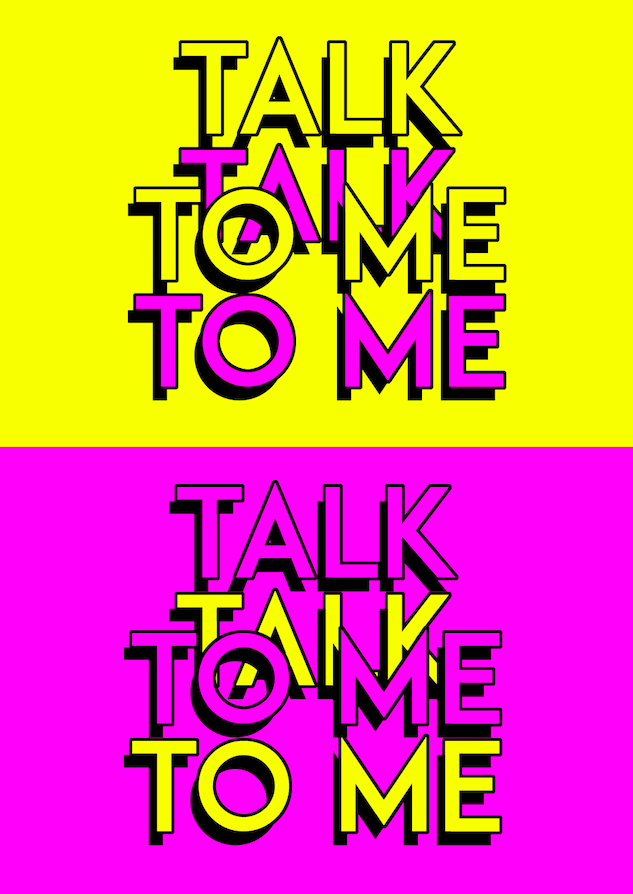
Each of the posters follows different experiments with layout, pattern, colour, composition and scale in order to make them as bold and interesting as possible with the main focus being the phrase relating to the issue.
 |
| Typeface deciding- Impact, Mohave, Adam. |
- How social media effects our relationships with other people: Fuck FOMO:


- The effects that social media has on our self esteem and mental health: You:


The effects social media has on our identity, relating to the 'fake' version of ourselves that we choose to display online: Is This Real?:


The negative effects on that social media has on our communication skills: Talk To Me:


4 further developed posters:


No comments:
Post a Comment