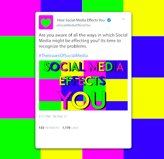
Critique comments mentioned that the stripe background design was visually interesting but slightly illegible, this design was edited further so that the typography is more legible (Design 4), this design also takes its references from an Instagram post.
Further, another critique comment mentioned that I could experiment more with different social media layouts and details such as Twitter and Facebook posts. I thought idea was useful and interesting so I created some further designs which focus on the layout of a Tweet and incorporated my designs and campaign information into it (Design 1,2,3).
Design 1 uses a tweet with a simple illustrative background relating back to the illustrations and abstract shapes used in the publication spreads in order to create consistency, this idea follows a more fun and young aesthetic. Whereas designs 2 and 3 focus purely on the layout of a tweet with more emphasis on little details, however Design 1 is visually more interesting.
I asked peers on which designs they thought worked best and most voted on Designs 1 and 4 which I also agree with. However, I will most likely use design 4 as the final cover as it looks more like a cover than Design 1 does, it is also more minimal which makes it more memorable whilst being eye-catching as it follows a more striking aesthetic.
 |
| Design 4- Possible Final Cover |


No comments:
Post a Comment