Overall, this has been the most enjoyable module this year. This was because I feel like I was allowed the most independence, which I prefer to a brief which has to be followed in a certain way, for example the Cell Phone Symphony brief. I think the module was based on really interesting themes; it was extremely fun being able to choose a micro-genre that we enjoy to produce work for, I also felt that Studio Brief 2 was the most successful group project that we have done this year.
I really enjoyed the first brief as the music genre that I chose actually interests me; Quiet Storm, which consists of 70s and 80s soul and disco music. My favourite elements were the J-Cards with the labels and the badges that I created as my object. I found it challenging but fun screen printing 4 different colour layers, however I think in the future I will limit my colour palette. I think the labels that I created add a nice little finishing touch to the cassettes, making them look more bold and funky. The badges were also really fun to design as I was able to experiment with one of my favourite techniques; collage, I would personally wear the badges myself. I also think my overall genre branding was successful as I followed a consistent colour palette where relevant. The packaging for the badges and cassettes was also successful, reminiscent of disco.
Additionally, I was really pleased that our group came second place for the exhibition branding. Our idea was successful because it was more interactive and fun compared to some of the other groups ideas, we chose to focus more on the idea of the tape trumps game. However, I think in some areas we needed more refinement, for example the poster looked more contemporary than retro.
If I were to improve anything it'd be my flag, I think it was more successful when it was digital and smaller. Since it doesn't have loads of little details, it works better in a smaller scale. However, advice off Ben and peers suggested that it looked better simplified, after showing the initial designs. Additionally, I did end up spending a lot of money on this module (around £80) however this couldn't really be helped.
Monday, 21 May 2018
Final Critique
Today we had our final silent critique in which I displayed all of my elements; my flag, J-Card inside the cassettes, cassette packaging, badges, badge packaging and stickers. I was really happy with all of my feedback as the majority of it was positive, everyone seemed to enjoy all of the elements and mentioned they mentioned that the genre was successfully communicated aesthetically. The areas that mentioned needed approving I agree with.
Positive feedback;
Positive feedback;
- The designs work really well, the research has clearly influenced the design decisions
- Loves the aesthetic , really get a sense of what the era/micro-genre was like first-hand
- The packaging is lovely. Really good attention to detail, a lot of effort has clearly gone into the work
- Stickers are interesting and add a really fun element. Are the collages your own? Yes I created them all myself, but used elements of imagery that I found relating to my genre, and then collaged and edited it together
- Packaging is really strong
- Flag is really strong- good use of colour, reflects theme best
- Nice type on spine of the cassette
- The production of the objects and packaging are really well considered, and covered well by the rationale
- Really love the overall feel
- The packaging is really good and work really well with the theme. The stickers and pins are really cool, they work well with the other elements
- The work connects and is visually pleasing, the bright colours stand out and are used well throughout the project
- Great flag
- Objects are very interesting and developed/produced well
- Love the packaging, could I think of a context it would be distributed under? This is how the badges and cassettes would be purchased online or in person
- Really nice attention to detail; the little sticker on the spine of the case
- The stickers are so retro and groovy
- Good roller disco idea! Everything matches this idea. Could get a disco ball for the exhibition. I like this idea! but I might not have enough room in the exhibition space for it
- Really nice flag
- Stickers are really cute!
Areas to improve/consider;
- Think of things to do for social media, photograph people wearing the badges. I like this idea, I will photograph the badges on clothing for my design boards
- Typography on J-Card could have been pushed further, more experimental in typeface or format. I agree with this, I could have experimented with layout more for the track list on the inside
- Could be simplified as I have a lot of visuals- could get confusing. It would be more helpful if they mention which element they mean
- Could consider adding a metallic layer to the flag. I really like this idea as it relates well with disco and the metallic packaging, I could do this with foiling. However, I don't think I have enough time to change it now
- Flag could be improved. I agree in some ways, however a lot of people mentioned they liked the flag
- J-Cards feel slightly detached due to more tropical colour scheme. This is due to the colours more being as vibrant when screen printed, this is just how the ink works. The digital versions are a lot bolder
Saturday, 19 May 2018
Final Packaging
All of my packaging has now arrived which means I can begin to stick the stickers designs onto them, along with packaging my badges inside. I packaged the badges inside the little coloured bags which are then packaged into the bigger metallic jiffy bag. Each badge is packaged in a different coloured small bag which matches the colours in the design, for example, the 'soul sister' badge is packaged into a little yellow bag as the colour yellow appears often throughout the design.
The colours of the metallic jiffy bags match the colours in my J-Card; gold/yellow and dark purple. The gold relates more to disco and the upbeat tempo of Quiet Storm, whereas the dark purple relates back to late night listening. Im not sure which colour I prefer so I will ask for advice off peers, or I may even use both as I have 10 badges (2 of each). On each jiffy bag I have experimented with different placements of the stickers in different scales.
Additionally, I have stuck to the idea packaging the cassette in the silver holographic bags. The bags were customised through stickers to match the labels on the cassettes, each bag uses the same illustration that appears on the label but in a larger scale.


 |
| The cassette packaging |
 |
| Cassette packaging close up |
Physical Badges
Today my physical badges have arrived. I had a few problems with the company that I ordered them from, the original files that I sent them were wrong as the design didn't cover the whole bleed area, so I had to edit the designs and send them with a wider bleed area in a similar colour to the design. However, the company didn't reply to my emails in enough time which meant that my designs wouldn't be here in time, this meant that I had to pay an extra £15 for them to arrive today.
Despite all of the communication issues, I am really happy with the final physical badges. I was worried that the quality of them might be too fuzzy and the text might be hard to read as they're quite small, however this wasn't a problem at all. The colours and quality is the exact same as the digital designs; vibrant and bold. I would personally wear the badges myself.
I have begun to photograph them in different ways, I will also now photograph them inside and with the packaging with the sticker designs stuck onto the jiffy bags.


New Labels and Stickers
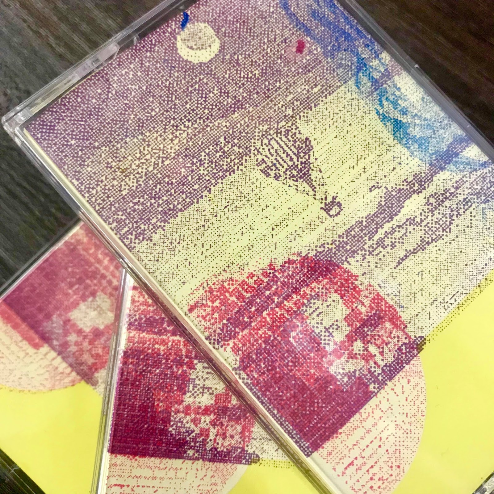
This afternoon I printed my new cassette label designs. I am extremely happy with them as they look a lot bolder and experimental than the first set that I printed on Monday. The specific colours that I have chosen contrast really well with the colours of the cassettes; the J-Card and labels use the same colour palette.
I have also printed the larger clear paper stickers that will go onto the silver holographic packaging for the cassettes. The illustration on the packaging matches the illustration used on each cassette label. I think they add a nice finishing touch as well as tying the two elements together successfully and subtly.
I also did a little photoshoot at home of my final cassette cases with the labels on, I think they all communicate my genre really well and Im also glad that I stuck to the decision of having different coloured cassettes with different labels on, instead of 3 of the same.


Thursday, 17 May 2018
Final Printed Flag
Today I was able to collect my A1 digital printed flag. I am really happy with the overall flag as it successfully communicates the theme of disco and night time, as well as radio. I was relieved that the quality of it came out fine as that was my main worry. However, the colours weren't as vibrant as the digital version, but that was expected anyway since it is printed onto a thin cotton fabric, whereas it'd be a lot brighter if it was printed onto paper or something thicker maybe. The edges were trimmed so that the background is purely the image of the night time sky.


Label Testing
I have printed my new cassette label stickers onto cartridge paper so I can place them onto the cassettes to see what they look like before actually sticking the stickers on. I think the new colour designs work so much better as they successfully communicate the upbeat, disco aesthetic. Coloured backgrounds make the designs pop a lot more.
For some reason the glasses label printed in blue instead of purple due to an error with the printer, however I didn't mind this I quite like the blue, the blue also appears in my J-Card design so it works perfectly. I will print the glasses label in the blue and purple to see which one I prefer.
Additionally, I have decided that I will package my cassettes in the silver holographic bags that I ordered as they fit perfectly with the disco theme and make the cassettes a lot more intriguing, the cassettes also fit in the bags perfectly. I am going to customise the bags by printing the singular illustrations onto clear sticker paper, in a bigger scale. The illustration sticker on the bag will match the illustration and colour of the label on the cassette.


The illustration stickers for the packaging:


Tuesday, 15 May 2018
Cassette Label Development
Yesterday I got my cassette label stickers printed. I got them printed onto clear sticker paper so that the colour of the cassette was still visible, I also thought this would look more professional than the normal white sticker paper.
The printed stickers came out really well, however when the yellow and the pink illustration stickers were stuck onto the cassettes, really weren't visible at all, the stickers looked almost distracting. This was a shame because the blue sticker was visible and looked extremely nice on the pink cassette.


I have decided to re-create my sticker labels as I have time now that I have finished my other designs, but this time I have created them using coloured backgrounds and onto normal sticker paper so that the designs are clear to see. I thought carefully about what colours to use for each cassette; the best contrasts. I have only used colours that appear in my J-Card design.
These are the new coloured backgrounds designs. I think these look a lot better and more disco and upbeat because of the vibrant aesthetic, I have coloured matched them to the physical J-Card screen prints. The yellow sticker would go on the purple cassette, hence the purple illustrations, the pink sticker would go on the clear/black cassette. Additionally, I quite liked the blue glasses label as it was with a white background, but I also re-created it with a purple background to see which I prefer once printed. The blue glasses label would go on the pink cassette.


The printed stickers came out really well, however when the yellow and the pink illustration stickers were stuck onto the cassettes, really weren't visible at all, the stickers looked almost distracting. This was a shame because the blue sticker was visible and looked extremely nice on the pink cassette.


 |
I have decided to re-create my sticker labels as I have time now that I have finished my other designs, but this time I have created them using coloured backgrounds and onto normal sticker paper so that the designs are clear to see. I thought carefully about what colours to use for each cassette; the best contrasts. I have only used colours that appear in my J-Card design.
These are the new coloured backgrounds designs. I think these look a lot better and more disco and upbeat because of the vibrant aesthetic, I have coloured matched them to the physical J-Card screen prints. The yellow sticker would go on the purple cassette, hence the purple illustrations, the pink sticker would go on the clear/black cassette. Additionally, I quite liked the blue glasses label as it was with a white background, but I also re-created it with a purple background to see which I prefer once printed. The blue glasses label would go on the pink cassette.


Monday, 14 May 2018
Sticker Printing
Today I have started to print my stickers to go onto my packaging and possibly other elements if appropriate. I printed them as the actual sizes of the badges (38mm) as well as other sizes; one size up, large and very small. Printing them in different sizes means I would have a variety of sizes to play around with, I also think the different sized stickers would create a funkier aesthetic if they were stuck onto the same packaging together.
I am going to wait until my badges arrive on Friday before sticking the stickers onto the packaging, it means I could see which sticker sizes work best with each packaging bag, with the size of the badges. I also printed the stickers in a really mini size to fit onto the spine of the cassette case, creating a link between the cassettes and the badge designs. I think the mini stickers add a really nice personal finishing touch to the cases, the placement also works well against the title on the J-Card, each case has a different sticker on to match the colour of the case.


I am going to wait until my badges arrive on Friday before sticking the stickers onto the packaging, it means I could see which sticker sizes work best with each packaging bag, with the size of the badges. I also printed the stickers in a really mini size to fit onto the spine of the cassette case, creating a link between the cassettes and the badge designs. I think the mini stickers add a really nice personal finishing touch to the cases, the placement also works well against the title on the J-Card, each case has a different sticker on to match the colour of the case.


Final Screen Printed J-Cards
I have now screen printed my final J-Cards. I am happy with the result as I managed to get the different layers lined up correctly and the yellow card worked really well. However, the colours aren't as vibrant as the digital versions of my J-Cards, however that is just how the ink works, I also think that the more muted, lighter colours link well to soul.
It did take me quiet a while (around 3 days including preparing my coating my screen) to screen print my J-Cards since they consisted of 4 different colours layers; blue, white, purple and pink. I think if I was to re-do my J-Cards, I'd re-create my design using only 2 colours. However, each colour used has a specific meaning which relates to Quiet Storm.
I began with the white layer. I needed a white layer for some of the colour layers to go on top since my paper was yellow, the colours would look different shades to how I wanted. The next layer was purple for the night sky background, followed by pink for the disco ball and then blue for the floral pattern. I then did the inside which displays my track list, the first layer was white, followed by purple.
I decided to stick with clear cases as tinted colour cases would change the shades of the J-Cards from the outside.


Casette Labels
I have begun to create cassette sticker labels which will be stuck onto the actual cassettes. Originally, I created these illustrations for my packaging as my initial idea was to create handmade boxes from card, the illustrations would be used on them, however that idea was a little bit bland and I am instead packaging my badges in jiffy bags reminiscent to disco, with my stickers on them.
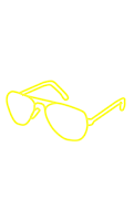
The illustrations are inspired by objects which relate to Quiet Storm. The roller skates are related to roller discos; popular evening event from the era. The old school radio relates to the fact that Quiet Storm first started out as a radio format. Additionally, aviator sunglasses were a popular accessory which was worn in the 70s.

Since these illustrations are minimal and effective, I think they work great as patterned cassette labels. Since the cassette labels are quite small, I can't create a design with too much detail and small type as it would become hard to see and over complicated with the J-Card design. Also, pattern relates to my genre as pattern was extremely popular in the 70s and 80s for fashion and interior design.
The colours relate to the colours in my J-Card design. However, each of my cassettes is a different colour; one dark purple, one transparent and one pink. I have thought about which colours would contrast with each cassette colour, the blue glasses label would be used on the pink cassette, the yellow roller skates would be used on the purple cassette, and the pink radio label would be used on the clear cassette.
However, I have also created each illustration in just yellow encase that works better, yellow would work well with each cassette colour as it is bright. The yellow also matches the yellow card which I have used for my screen printed J-Cards.


 |
| The labels ready to print, they will be printed onto clear sticker paper so that the colour of the cassette is visible underneath |
Saturday, 12 May 2018
Final Flag
After developing my flag and making all the changes that were mentioned on Thursdays critique with Ben and peers, I now have a final flag design that I am happy with. I focused thoroughly on the 3 aims that I had for the flag; to communicate the idea of late night listening, radio and disco all into one design but in a more minimal way than the initial designs. The genre Quiet Storm was originally a radio format from 1976 specifically made for late night listening, consisting of disco and soul music.
The three colours main colours that I used for the flag are inspired by the initial 5 colours that I researched, the dark colour blue takes its inspiration from the fact that Quiet Storm was first originally made for late night listening, where as the bright pink relates to disco, pink also relates to soul as soul music lyrics are mainly about love; the colour psychology of pink is unconditional love and nurturing. The white is inspired by where Quiet Storm first started; Quiet Storm was pioneered Melvin Lindsey, while he was an intern in Washington, D.C, a popular tourist attraction in Washington is the White House. The 3 colours used in my flag are also used in my J-Card which links them both together nicely in a subtle way. Also, the image of the African American woman relates Quiet Storm, as the the listening audience back in the 70s was mainly "upscale urban" African Americans.
Also, the moon figure in the night sky background has been developed and replaced with an image of an old school radio dial with a disco ball. The shape of the disco ball takes is inspired by a crescent moon, this was done so that the moon figure is more obvious, rather than just looking like a collaged circle.
Furthermore, the small type that I have placed around the moon shows the original radio station that Quiet Storm was played on 'WHUR 96.FM'. I have placed the type to fit around the moon figure so that it looks like a part of the collaged moon, instead of being randomly placed somewhere.
I am really happy with the end flag design as the minimal style works a lot better as my earlier flag development designs looked a little bit too all over the place and busy. I think the minimal style also exaggerates the idea of late night listening, giving off a funky disco night aesthetic whilst also displaying a retro aesthetic because of the 70s radio dial and fuzzy old school quality figure of the African American woman.

Thursday, 10 May 2018
Flag Development
I have now started to develop my flag design further after having a mini crit on them on Tuesday. Some suggestions that were made were to make it more disco by perhaps replacing the moon with a disco ball or a radio dial, or combining them into one shape. The idea of adding the imagery of radio is relevant as it plays on the idea of Quiet Storm starting as a radio format. Another suggestion that was made was to take away the type and maybe replace it with some language/type related to the original radio channel; WHUR 96 FM, also the remove the hot air balloon. Another general thing to change was the colour palette to look slightly more 70s/80s appropriate, matching the J-Card
These are the first 2 developed designs after the critique, the pink colour was changed to match the pink in the J-Card, I also added yellow into the second design to match the J-Card. The second design is the more developed version as it includes more imagery that was suggested, the type was changed to 'WHUR 96.FM, Washington DC 1976' to tie in with the original radio station. I also added line drawings for a more detailed and radio reminiscent look; the radio dial around the moon as well as an illustration which I created from a photograph of a 70s radio.
 |
| This was the design that I showed in the critique |
These are the first 2 developed designs after the critique, the pink colour was changed to match the pink in the J-Card, I also added yellow into the second design to match the J-Card. The second design is the more developed version as it includes more imagery that was suggested, the type was changed to 'WHUR 96.FM, Washington DC 1976' to tie in with the original radio station. I also added line drawings for a more detailed and radio reminiscent look; the radio dial around the moon as well as an illustration which I created from a photograph of a 70s radio.
However, I think maybe the second design is too detailed, there is too much going on, simplicity works better.


After speaking to Ben this morning, we decided that the simpler designs work best and that I should simplify my design even more than the first design. The main aim ideas that I am trying to communicate throughout my flag design is disco, radio and that fact that the genre was originally made for late night listening, the flag should include elements of each idea but in a minimal but effective way. I took away the white border as it was un-needed, the sky background exaggerates the idea of night time as well as the moon, I also took away the green shapes as they were irrelevant.
Simpler design number 2 experiments combining the disco, radio, and moon into the same image, I think this works extremely well as it communicates all of the 3 flag aims into one, instead of using loads of separate imagery to over complicate the flag. The colours were also refined down to 3; blue, white and pink, the blue and the pink are the same shades as the blue and pink in the J-Card.
The last design is my favourite so far, I may possibly use this as my final flag design, it just needs tweaking a little now; the type around the circle needs refining. The type on the flag uses the key information of the Quiet Storm radio format from the 70s.
 |
| Simpler design 1 |
 |
| Simpler design 2 |
Wednesday, 9 May 2018
Packaging Ordering
I have now started to order packaging which would be used to package my badges. Coloured jiffy bags were suggested in yesterdays critique as they would link well with the genre as the metallic style of them matches the disco theme, reminiscent of a disco ball and party decorations. Furthermore, the jiffy bags would have the badges packaged inside them with the stickers stuck on the outside of the bag, the stickers would be the same design as the badges or the stickers could even come as an extra element with the badge inside the bag.
I started to research websites which sell interesting metallic coloured jiffy bags. However, a lot of the websites were either very expensive or the postage costed more than double the price of the bags that I liked. Another issue that I found was that I couldn't find jiffy bags small enough, my badges are going to be 38mm, however the smallest jiffy bag sizes were around 140mm x 165mm.
In the end, I managed to find some more affordable bags. I ended up ordering 2 165mm x 165mm coloured metallic jiffy bags in gold and purple to match the colours in my cassette, this was the smallest size I could get in them so I thought maybe all of the badges could go into one bag. I also ordered 3 holagraphic bags in 114mm x 162mm, I thought maybe the cassettes could be packed in these instead of the badges, but I'll see what they look like when they arrive. Furthermore, I also ordered some small sealable coloured bags for the badges, each badge would go in a different coloured bag, the size of these was also perfect for the badges; 50mm x 50mm.
I started to research websites which sell interesting metallic coloured jiffy bags. However, a lot of the websites were either very expensive or the postage costed more than double the price of the bags that I liked. Another issue that I found was that I couldn't find jiffy bags small enough, my badges are going to be 38mm, however the smallest jiffy bag sizes were around 140mm x 165mm.
 |
| The postage for these bags was £10.95 when the bags only came to 80p, so it really wasn't worth ordering these ones. |
In the end, I managed to find some more affordable bags. I ended up ordering 2 165mm x 165mm coloured metallic jiffy bags in gold and purple to match the colours in my cassette, this was the smallest size I could get in them so I thought maybe all of the badges could go into one bag. I also ordered 3 holagraphic bags in 114mm x 162mm, I thought maybe the cassettes could be packed in these instead of the badges, but I'll see what they look like when they arrive. Furthermore, I also ordered some small sealable coloured bags for the badges, each badge would go in a different coloured bag, the size of these was also perfect for the badges; 50mm x 50mm.
 |
| I ordered the gold and purple jiffy bags from this image |
 |
| The holagraphic bags I ordered, reminiscent of a disco ball. |
 |
| The small coloured sealable bags |
Tuesday, 8 May 2018
Mini Critique
Today I had a mini critique with Ben and a few of my peers. The critique was quick and useful, I presented what I had created so far and was then told what I could develop and what worked well as it was, I presented my J-Card, flag and objects.
Notes from the critique:
Notes from the critique:
- The badges were liked, the only thing to develop for them now could be to possibly change the colour palettes so they all slightly match... or make the colours match the J-Card if needed? However, they work well as they are as well.
 |
| The badge designs that I showed in the crit |
- For the badges, next think about how they'd be packaged. Coloured jiffy bags were suggested with the stickers stuck on (the stickers would be same as the badges). Jiffy bags would link well with the genre as the metallic style of them matches the disco theme, reminiscent of a disco ball and disco parties.
- The flag:
- Make it more disco by perhaps replacing the moon with a disco ball or a radio dial (making it link with the J-Card and the fact that the genre started as a radio format)
- Take away the type and replace it with type related to the original radio channel (WHUR.FM)
- Change the colours slightly to look more 70s/80s appropriate, match the J-Card
- Remove the hot air balloon
- A reflective light could come off the moon like a disco ball reflection.
 |
| The flag that I showed in the crit |
 |
| (not finished) The flag now after making starting to make the changes, still developing |
- The J-Card was liked overall by Ben and my peers. The only change that could be made is that for the back of the J-Card, the title and artist could be different weights or styles to separate them… However, I have already screen printed my J-Cards as they are, if I have time I could maybe change it but it seems a bit much to re-do the whole J-Card (consisting of 4 colour layers) just for a small adjustment, I could show it with the different type digitally and on the design board.
 |
| Opposite alignments |
 |
| Artists name in Itallic |
 |
| Artists name slightly smaller |
Subscribe to:
Comments (Atom)