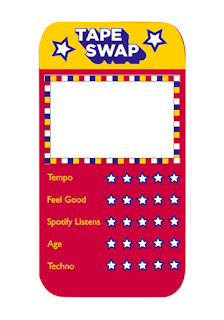
Also, we discussed whether we wanted to focus more on the actual branding of the exhibition and the exhibition itself, or promote the idea of being able to play a game whilst at the exhibition more. We decided we want to focus more on the theme of being able to swap and play at the exhibition, a more interactive and unique approach rather than just the branding. So we had to thoroughly think through what we do next, this included;
- Editing the invites and poster to promote the swap game more
- Change the rating system on the top trump cards
- Re-do the logo
- Focus on how we promote it on Instagram
- The guests receive the top trump cards at the door, rather than them being posted, this means that anyone could take part instead of only people with invites
 |
| New edited logo |
Furthermore, I had started to create some top trump card layouts, however these needed changing after discussing with Orlando. The overall aesthetic is inspired by Swap Shop, but changed to be more appropriate. Furthermore, the star rating idea comes from the stars in the logo which were inspired by the original Swap Shop logo.
This is what the cards look like now after I have made all the changes discussed. These designs use the new logo, as well as a different rating system, it was felt that the star rating idea wasn't clear enough in terms of describing the genre successfully, so this was changed to percentages in the same way as classic top trump cards. I created these designs as if they were the actual top trump cards by basing them on 2 of the actual genres from the micro-genre spreadsheet which was filled in by the second years. Furthermore, I used two different colour designs as each person receives two cards upon arrival.


No comments:
Post a Comment