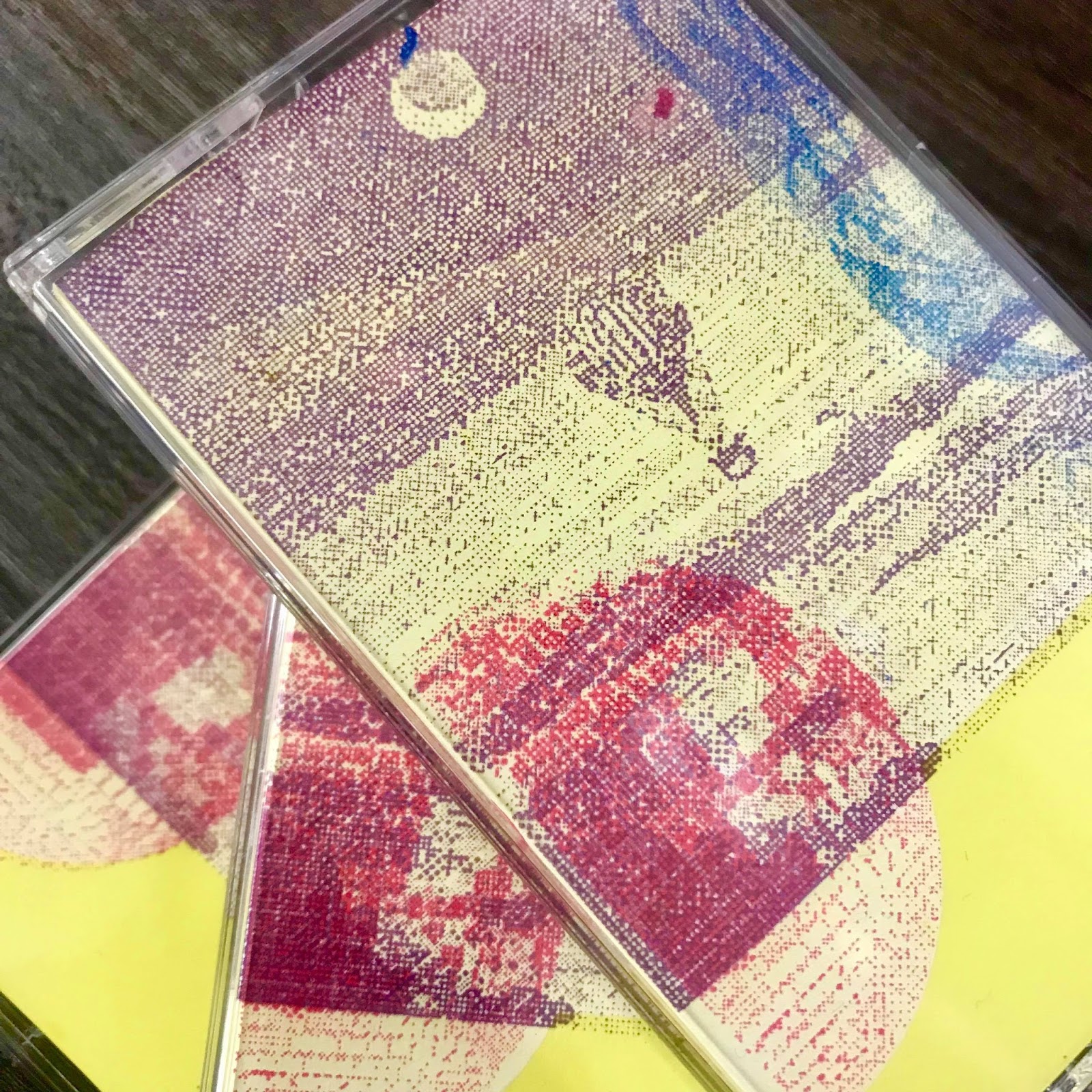
It did take me quiet a while (around 3 days including preparing my coating my screen) to screen print my J-Cards since they consisted of 4 different colours layers; blue, white, purple and pink. I think if I was to re-do my J-Cards, I'd re-create my design using only 2 colours. However, each colour used has a specific meaning which relates to Quiet Storm.
I began with the white layer. I needed a white layer for some of the colour layers to go on top since my paper was yellow, the colours would look different shades to how I wanted. The next layer was purple for the night sky background, followed by pink for the disco ball and then blue for the floral pattern. I then did the inside which displays my track list, the first layer was white, followed by purple.
I decided to stick with clear cases as tinted colour cases would change the shades of the J-Cards from the outside.


No comments:
Post a Comment