Critique comments also mentioned that the condom typography that I created for the front cover of the concertina book was really interesting and that it could also be used on the posters instead of the handwritten type.
The tooth brushing inspired poster was developed through incorporating Durex into the toothpaste instead of the toothbrush. The toothpaste now looks like it is a Durex product which is a lot more interesting and refined. The toothpaste uses the Durex logo as well as the campaign tagline in the 4 different languages that Durex condom wrappers also use.


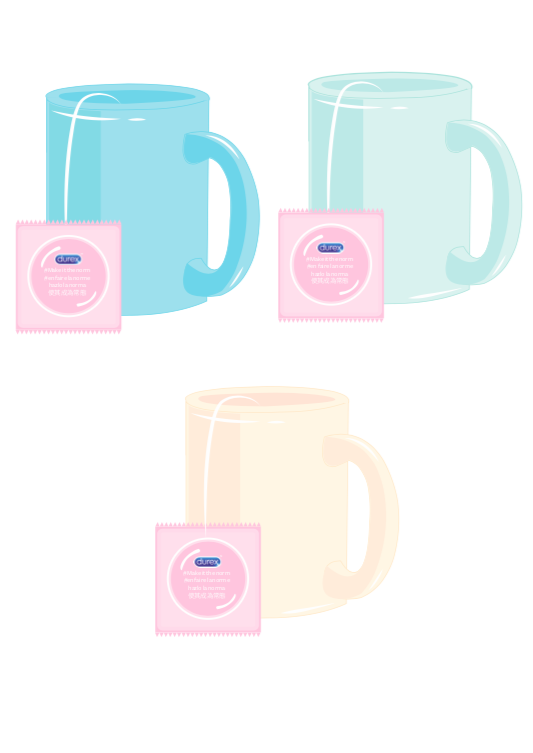
The cup of tea inspired poster was the one that was developed the most, this was because a lot of different colour experiments had to be created in order to match with the background. Usually a cup is white, however a white cup didn't match with the rest of the page and the other posters as it isn't bright and fun. The main colours used in the end were yellow and blue together, which relate to the colours in the typography.


Furthermore, the wallet inspired poster didn't need much developing as I was able to use the same illustration as my social media video which focuses on the same concept.


No comments:
Post a Comment