- Logo and social media: Jake
- Posters: Josh
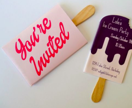
- Invites: Megan
- Exhibition layout: Sara and Lewys
- Catalogue: Me and Elise
- Presentation (putting it together): John
Furthermore, we have also decided on the basic rules that we will follow when designing each element so it is all consistent and looks professional:
- Colour scheme: The blue, green, yellow and orange from the original Swap Shop TV show, however we will use them differently so its not exactly the same.
- Possibly a grid if needed, or take inspiration from the Swap Shop book cover layouts as we all found them really interesting and liked the retro aesthetic (figure 1)
- Typeface: Something retro but geometric and simple, we researched the typefaces used on Swap Shop and felt that Gill sans would be most appropriate for our designs.
- Retro border layouts used on invites and other elements where appropriate (figure 2)
 |
| Figure 1 |
 |
| Figure 2 |
Furthermore, after discussing with Ben, we have decided that we want to physically use the theme of a swap throughout the actual exhibition. After brainstorming ideas of how we could make the exhibition as a place to 'swap', we have decided that we will do this through the idea of Top Trump Cards. Top Trumps is a card game published in 1968. Each card contains a list of numerical data, and the aim of the game is to compare these values to try to trump and win an opponent's card.
We will portray the theme of top trumps throughout the exhibition through the invites and the catalogue; they will work like top trump cards. Each person will get sent 3 cards, one being the invite and the other 2 being 2 top trump cards based on a genre, the visitor will then be able match their card to a genre inside the exhibition, and then physically play top trumps by swap their cards with other people at the event. The top trump cards would include the name of the genre, a photograph underneath, and then the genre characteristics/categories (5 different ones). Me and Jake thought it would be a good idea to use star ratings for the cards instead of percentages, e.g. if the category was age, a genre from the 60s would have 5 stars as it would be the oldest, where as 21st century genres would only have one star.
Furthermore, since the invites will be like top trump cards in the same way as the catalogue, I discussed design decisions with Megan and sent her a brief template that we would use. We decided to take inspiration from figure 2.
We have also had the idea to display the flags as a clothing rail to continue playing on the idea of the exhibition being like a Swap Shop, the visitors could look through the flags on hangers on the rails.