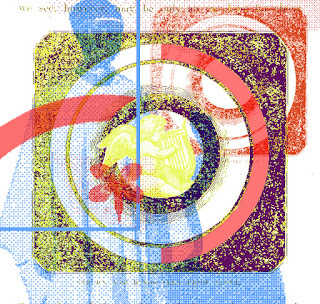
At first I didn't really enjoy this task as my very first designs were looking a little too minimal and block coloured. However, once I started to experiment more with colour and textures, my designs started to come along more. I really enjoyed being able to experiment freely with the 2 techniques. When creating my designs, I took inspiration from Quiet Storm record covers as well as my 25 items research task.
I think the colour contrasts work best in my designs, the bright and neon colours were inspired by the 70s disco era, whereas the more muted colours are inspired by 70s clothing and interior. I think the layering also works well throughout my designs; I have used quite a lot of layers in most of my pieces whilst still leaving negative and white space for contrast.
My favourite designs are number 1, 3 and 4. I love the use of neon colour and collage in design 1, the vibrant night-time effect reflects on the micro-genre as Quiet Storm was originally made for late night listening. Whereas designs 3 and 4 follow a more abstract approach, the colours schemes in both work well. I like the combination of hand drawn illustration with the photographs in design 3, and in design 4 I love the minimalism and the contrast between the blocks of yellow with the purple photograph. My least favourite design is number 6 as I think it is a little bit too obscure and abstract; it doesn't have enough structure. I also think the colours don't represent the genre Quiet Storm.


No comments:
Post a Comment