Irma thoroughly experiments with what a book can be and how it can be expressed through its size and form. She mocks up full-scale versions of her books, but also construct miniature versions of them, allowing her to see the distribution of images and text better. I feel like this almost gives the book a personality (how big or tiny it is).
I was also inspired by the book that she created for Chanel for its Chanel No.5 perfume, which consisted of zero ink whatsoever. Each white page is embossed with a drawing or quotation that tells the story that is aimed for. Most books are bound and cut, however the pressing process would rend the embossing flat- this meant that Irma had to figure out a different way to make sure the designs kept their subtle form. In the end, an old letterpress machine was used, with the ink removed. Each page was designed first on an aluminium plate and then turned into a mould that the pages would press against. I love the originality and delicacy of this book and feel that the technique/aesthetic was extremely relevant to the brief.
Additionally, I feel that my book would be most appropriate as a travel size as my target audience is people that are interested in language/eager to learn Urdu or possibly people travelling or that have recently moved to a place where Urdu commonly spoke. The book needs to be a reasonable and easy size to carry around and slot into a small bag. I visited the library to find books that would be around this size.
 |
| Square shaped book |
I think a square shaped book looks extremely effective and neat, however they are harder to keep open and lay flat which would be a struggle when travelling or wanting to concentrate. I then searched for appropriate rectangle sized books.
 |
| Landscape |
I really liked the aesthetic of this landscape book and I thought the size was also perfect (not too big and not too small either) However, landscape would not be appropriate for the way I want to present my content inside. The book will work as a normal english book (left to right) whilst at the same time working as an Arabic book which is typically right to left. This would be achieved by flipping the book upside down- this wouldn't be as effective in landscape.
 |
| Comparison of landscape and portrait |
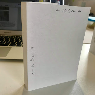
I then took some measurements of the books that I felt were most appropriate and decided that a rectangular portrait book would be best. The measurements being 10.5cm width by 14.5cm height, this was most appropriate out of the 3 experiments that I tried for my language book. The book couldn't be too small as it would become harder to understand as the Arabic letters are quite detailed.


No comments:
Post a Comment