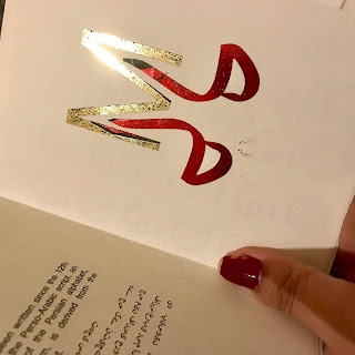
I first foiled onto the cartridge paper that I was planning to use as the embossing worked really well on this paper. However, the foiling came out quite patchy on this paper...but this might not be an issue when I foil properly using a heat press instead of the laminator.
Additionally, I found that the foiling worked loads better on the antique white paper that I later purchased; the foil looked a lot smoother. Also, the foiling on the antique white paper image shows the foil design that I have decided to go with for my final cover, this one looked best out of my 3 initial designs. I felt that the other designs looked a little too pastiche.
 |
| Foiling on cartridge paper |
 |
| Foiling on antique white paper |
I have created a mockup version of my language book which uses foiling on all of the double page spreads (on the letter pattern page). Some of the pages turned out better than others, but hopefully this won't be an issue when I foil the final book properly. I also used the antique white paper for these mockup pages. I am happy with how they turned out.
I now need to emboss the cover with foil to go with the mockup as a hardback cover, this will shown at Fridays critique.
I also foiled my pages onto red paper using silver foil. I really like how these turned out as the silver looks really rich and classy on the darker paper which is what I want. However, the only issue is that the silver is quite hard to read for the small text...Another idea is that I could just print the text in white without foil. In Fridays critique, I will ask if people prefer the antique white paper version or the red paper version.


No comments:
Post a Comment