Friday 30 November 2018

Page Viewing Options Development

I felt that some of my app page layouts needed developing as some areas looked a little bit simple but in a basic way. The layouts still need to be minimal, however they could definitely have a stronger UI and UX, the pages that I developed were the gallery and favourites page.

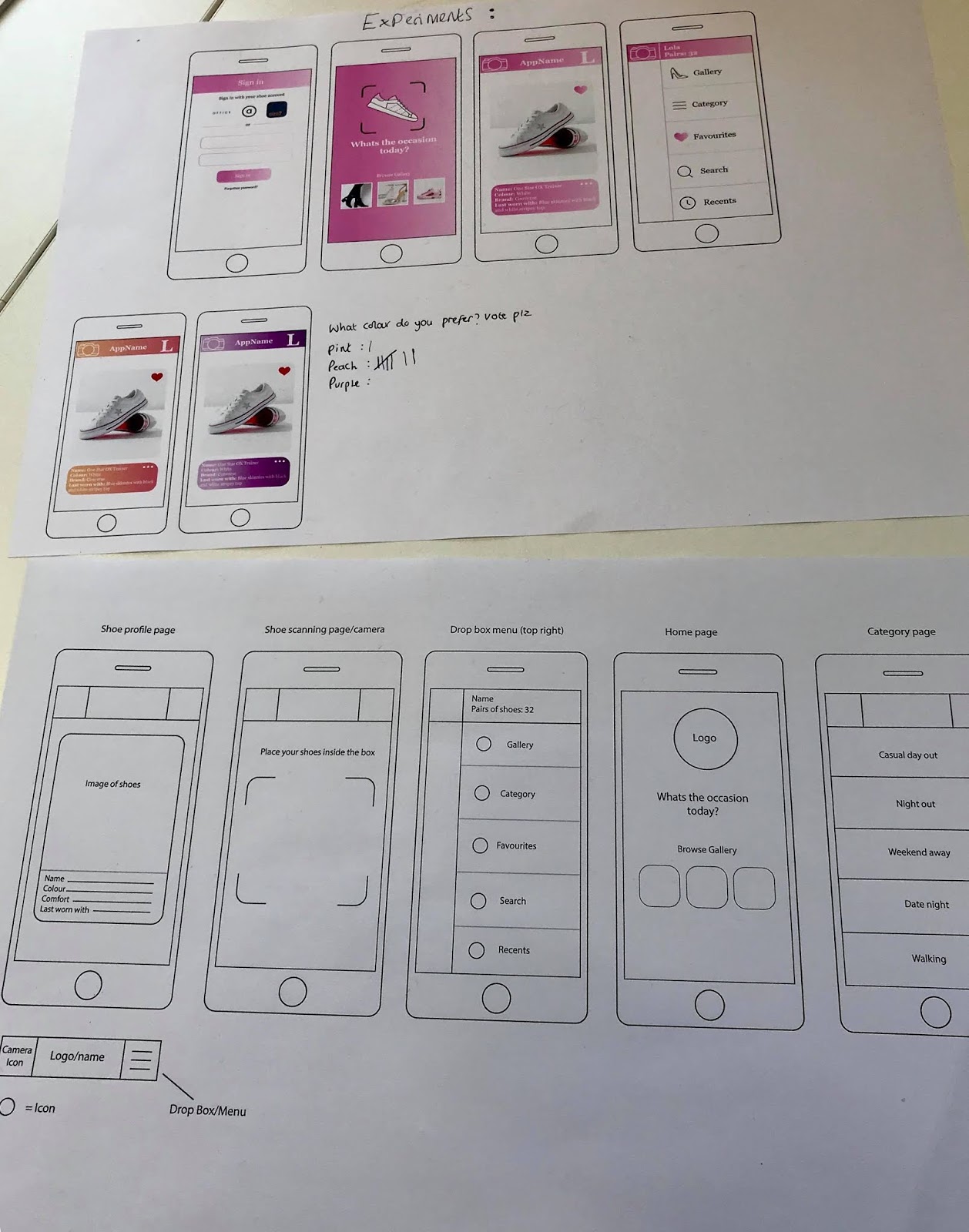
I noticed that on the other online shoe apps when scrolling through the shoes, the website and often app too allows the user to choose from two different layout options. One of the layout options usually uses a few shoes in rows of 3/4 (smaller images), and the other layout option uses less rows (bigger images) This feature is useful and good UX as it takes into consideration the users needs, a user with bad eyesight may prefer to use the version with less rows and bigger images, whereas a user that wants to scroll through the page quickly would most probably use the layout option with more rows and smaller images.

'Size?' website

'Office' website

I have applied this feature to my favourites page. I felt that the layout page looked extremely boring and basic before, it didn't really have much going on and didn't give any information about the shoe either. I felt that the developments look a lot more effective and refined.

Before

The first layout option that the user can choose from displays the shoes in rows of 2, with the shoe description underneath the image and an option to scroll through the other pictures. When the user clicks onto the lighter square in the top right corner, the get directed to the other layout option. This layout option uses just one shoe per row, with the description to the left of the image, with an option to remove the shoe from the favourites page. I think both layouts work really well.

After, with the two different layout options

1. The one shoe per row option/button
2. The two shoes per row option/button

Additionally, I also added this multiple layout option to the gallery page. The original gallery wasn't changed too much as it still displays the images in rows of three, but with the multiple layout option button in the top right. The other layout page that I created uses one image per row with the description below the image, with the option to scroll through other images of the shoe on it.


1. 3 images per row option/button
2. 1 image per row option/button


I have created a video showing how this feature physically works:


Thursday 29 November 2018

Working App

For tomorrows critique, it is important for me to show how the app would actually work in order to gain the most feedback, so I have begun to create experiments of the app physically working using Adobe XD.

I found the Adobe XD extremely useful as it was so easy to understand and it actually makes the working app look professional as if it were real. The programme allowed me to simply copy and paste each page into the exact dimensions of an iPhone 6/7/8.


The images below show some of the prototype links from page to page. The process of this simply allowed me to select each button/link and link it to the page that I want it to go to. Some of my pages only go from one page to another (launch page to log in page), whereas some of my pages have up to 4/5 links.


Working app:


Wednesday 28 November 2018

Search Extension & Icon Development

I have created an extension page for the search page, showing what would come up once you've used the search bar. The page that I created shows an example of a search for 'black boots'.  The search results simply show all of the black boots from the users gallery with a description of each pair of shoes; the name, brand and colour (black obviously). The page also subtly displays how many pairs of black boots the user owns.

The first mockup that I created uses the original peach gradient with white text. However, I felt like the peach gradient was a little bit too heavy as the rest of the page also heavily uses the gradient. I then developed the page using the gradient with a lower opacity (this is also used on the scan page and the drop box menu page example), with black text. This works a lot better as it is more subtle and the black text is more legible and professional.


Additionally, I have created an app icon after doing some more research on the apple app design guidelines. The app icon is visible on the home screen and apple store; it is the first thing that the user will see so it needs to be eye catching. The app icon needs to be simple so that it is recognisable and provide a single focus point. The apple guide lines also say that the app icon should only include words if they are essential to the logo and that photographic elements should be avoided.


I have kept my app icon extremely simple; using the same minimal design as my apps launch screen (the logo with the gradient peach background)

Mini Crit

I showed two of my peers all of my app pages/links so far and asked what they think still needs tweaking before the final critique on Friday. 

The main things that they said may need tweaking is the colour of the drop box menu icons from the black to the peach gradient and the colour of the yellow search box to match the other buttons. One comments mentioned to possibly re-consider the size of the text box/rounded edges on the shoe profile page, as it could look a little bit like a text box/message box. However, the rounded edges match the overall aesthetic of the other pages as rounded edges are used on most pages for buttons and images.

1.

 Before (black icons)

 After (peach gradient icons)

2.

Before (yellow search button)

After (search button changed to match
the colour of the rest of the buttons)

3.

Before (rounded corners text box)-
I still think I prefer this version

After (rectangle text box)-
this looks a bit out of place with
the rounded corners photograph

I have also developed the gallery page as I felt that before it looked too similar to the layout to the search page link. It is important for them to follow the same general aesthetic but there does need to be a slight difference because they are different pages. The bigger photographs on the gallery page also make them easier for the user to see, it doesn't matter so much on the search page.

The search page

Gallery page (BEFORE)

Gallery page (AFTER)

Specific Page Development

I have continued to develop my apps pages this week but I have focused on specific pages more thoroughly where I think needs more tweaking. So far this week, I have focused on the scanning/camera page and the category page. I have also created an extension page for the category list page (showing the page that comes up once you click onto one of the categories), I have also created the search page.

The category page has been developed through making the links look more like buttons through using the peach gradient instead of the just the white background with lines to separate each category. I have created two different developments, the first one uses the categories in rounded boxes to make them look more like buttons, whereas the other development uses still uses the full rectangles with the arrows on the far right, but instead with the peach gradient.

The first one looks more like buttons but the other one looks neater, so not sure which one to go with. I will raise this issue in Fridays critique and get people to vote on which they prefer.

Before


Below shows two different developments of how the page would look once you click onto one of the categories, I created a page for the 'Date Night' category. This page uses a similar layout to the 'suggestions' for the users ease, also because it is successful because it shows the shoe on a large scale with its details. The first development uses a small banner on the top which displays how many pairs are in this category, as well as a little link for the recently added pairs to this category. The final version of this page (second image) has removed the light gradient banner as it looked too tacky and unnecessary, instead it simply uses black text- a lot more minimal and legible. The 'info' icon is also changed from a black circle to the peach gradient to match the overall page aesthetic better. 

'Date Night' category link developments

Additionally, I have added more content into the scanning/camera page. The first page is purely just the camera where you photograph the shoes by placing them in the box. The second page shows what comes up once the user presses the camera button and the app recognises the pair of shoes from the other apps; a little box appears with the basic information of the shoe with a link to add it to your gallery. 

The first photograph I used for this development (the red carpet) clashed too much with the peach gradient. I then developed this the page by taking the photograph on a more subtle floor (light wood), I also positioned the shoes better to fit into the scanning box as well as changing the camera button to a white outline.


I have also created a search page which allows the user to input keywords such as the colour or name of the shoe in order to find a specific pair of shoes that they have in mind easier than going onto their gallery or the category page. The search page brings up the apple keyboard as the user is more familiar with the apple keyboard than if I were to make a custom keyboard, it is also obviously more relevant for an iPhone in general. I used the template of the apple keyboard but in the light/white colour mode as it matches the app more than the dark mode. I still think this page needs a bit of tweaking.


All the pages/links so far:

Tuesday 27 November 2018

Only Studio Talk

Based in Manchester- studio of 5 designers

Design for screen:
  • Primary means of consuming a brand
  • Experiential/interactive
  • Its here to stay
  • Animation can help to elevate the product
  • Inspiration: siteinspire.com, awwwards.com
Design process:
  • 1. Research: competitors, audiences, personas, principles 
  • 2. Wire framing: ideation, test assumptions, client buy-in
  • 3. Design: Apply the branding to the wireframes 
  • 4. Front End

Monday 26 November 2018

Launch Page Development and Apple Guidelines

After reading some of apples app design guidelines, I have found out that it is important for every app to provide a launch page. A launch page makes the user think that the app is loading faster than it is; without a launch page the user would think that the app has probably crashed. A launch page needs to be simple and effective. I have looked at some launch pages from apps on my phone.

Instagram launch page

HSBC launch page


I noticed that the most of the launch pages for apps on my phone simple just use the logo on its own or the logo with the name of the app. I decided to keep my launch page as the logo with the name of the app once I decide what it is. The first page that would appear after my launch page is the login page.


More points to take into consideration from the apple app design guidelines:


App Development

I have now started to develop the app pages and links using colours and content, as well as responding to feedback from Fridays critique.

The colour palette has been changed from a gradient pink to a gradient peach; critique comments mentioned that this colour palette worked best out of the ones I displayed and asked for a vote on. The peach is still feminine whilst not being too much (the pink was a bit TOO girly). The two colours that I have used for the gradient are Pantone 155 C and Pantone 2029 C. I have applied the new colour palette to the 4 pages that I made last week and on the new pages/links that I created today.


Furthermore, one of the critique comments mentioned that they liked how the first mockups integrated similar layouts to insta/snapchat as they are apps that people are pretty familiar with, I hadn't actually realised this myself. I have continued to incorporates some similar layout features to popular apps that the user is already familiar with; making it easier for the user to navigate right from the start. A lot of apps can be confusing when they require a lot of adjusting.  

Additionally, I have added content into the scanning page. I felt that I needed to show what happens after the shoe scans successfully and how you actually add it to the gallery afterwards automatically. Once the shoe is scanned, a little box pops up once the app has synced the shoe details from the original shoe apps, you can then add the shoe to your gallery (the second image shows a mockup of this).

All I need to do now is develop a mockup which uses a photograph of actual shoes. The photograph/camera screen goes behind the peach gradient. 


I have also developed a gallery page and a suggestions page. The gallery page displays all of the users shoes that they have scanned in, this allows them to easily look at all of their shoes outside of the category page (a lot easier than physically searching for shoes at home) the little heart represents shoes that are in their 'favourites'. The layout is simple as some people have a lot of shoes, it can't be too busy and confusing. However, I do think it needs more developing.

Additionally, one of the critique comments from Friday mentioned that the app could suggest shoes based on the shoes the user already has in their collection, for example if the user needed a new pair of trainers for the gym. I loved this idea as I often find myself on suggestion pages when online shopping (if there is one). The suggestions link is also useful because at the same time it promotes the shoe apps/brands that it is an extension of.

When clicking on the information icon next to the shoe, the app gives your information on which app you can buy the shoes on. 

Gallery page

Suggestions page

Furthermore, the 'categories' page also needs a lot of developing as at the moment I think it looks a little bit too boring and basic. In order to do this, I could create little icons based on each category and make the boxes look more like buttons/links.


All the app developments so far

Friday 23 November 2018

Silent Critique Feedback

Today we had our first silent critique on our app wireframes and other elements that we had created this week. I displayed my 5/6 main wireframes with the 4 developed page experiments which included colour, content and images. I was really happy with all of my feedback as it was all positive with some really great suggestions on how to develop my app designs furthermore. Everyone seemed to enjoy the idea and people also mentioned they would see themselves using it.

In the critique I made a little note which asked people to vote on which colour scheme they preferred the most out of the original Pantone pink gradient, a peach gradient and a purple gradient. As I thought that the pink may be a little bit too girly. The peach got 7 votes where as the pink got 1 and the purple got 0, I am happy with this vote as I also think the peach works best, its still feminine without being too over the top. The peach is also more vibrant, making it more exciting.


Feedback;
My response 

  • Sound idea- would be simple enough to use. Good idea to have a gallery for users to store their shoes
  • As well as 'last worn with' you could have 'best worn with/would pair well with'
  • Simple layout
  • Prefer the orange/peach colour scheme personally- I agree
  • Nice concept- something I would use. I like that it works off an occasion- most of the time I wear the same shoes other than an occasion- Thank you, since my peers would personally use the app. it means that it would work in the real world which is the aim.
  • Wireframes looks polished and professional 
  • Could you use outfits too? Not so much the whole app for clothes but could you upload an image of your outfit and change the shoes on the app so you can see what the overall outfit will look like?- I did consider this, however I want the focus to mainly be on the shoes and not clothes as well since it could become too complicated. Keeping it as just shoes makes the brief more focused. 
  • Maybe try some other layouts too? This is effective but many too obvious? I will continue experiment with a few different layouts for each page before deciding on one.
  • Could you make a mens version? I know many guys that would use something like this- This could be interesting, or I could just make the app more gender neutral? I will make a mens version and see how I feel then. However, a lot of people that I spoke to mentioned that the brief is more appropriate for women
  • The app looks like it would be easy to navigate through- which is good as in a scenario where someone is limited for time and needs to find a pair of shoes to suit their outfit
  • Easily accessible, this is the best approach
  • Could your colour schemes be more relevant to the shoe store you link it to? Whilst having a heavily feminine colour scheme? e.g. clarks- a green/cold colour scheme. Linking to brand identity? The app is an extension for a few different shoe apps, not just one so i'm not sure this would work
  • I like how you have integrated similar layouts to insta/snapchat as they are apps that people are pretty familiar with- links to ease of access- Thank you, I didn't realise myself that the layouts looked similar to them.
  • Like the idea- does it need to be limited to just women?
  • Could you expand the app? Say if the user needs a new pair of trainers for the gym could the app suggest some based on the shoes the user already has in their collection? I like this idea, a 'suggestions' feature would be interesting and effective as it would promote the other shoe apps.
  • Could the app have a feature encouraging you to wear a pair of shoes that you haven't worn in a while? Prevents the user forgetting about certain pairs of shoes
  • Are you able to look at other people profiles and see their shoes? More interactive- This might make the app less personal?
  • I like the peach colour scheme and I think it will appeal to a wider audience- not all women are super girly whereas the pink is- I agree
  • Well considered
  • Could you also have a 'when last worn' bit so you ensure you're not wearing the same shoes all the time
  • I love this idea. I like how it can categorise the shoes for you automatically
  • The idea of taking pictures of all your shoes could be lengthly but once the start up process is done it would be very easy to use- The app allows you to add/scan more shoes whenever the user wishes, they don't have to add all their shoes at once but they can if they want to
  • 'Shoes you may like' page? Links to the 'suggestions' feature'
  • How would you make the camera work functionally depending on lighting etc- The scanner page shows instructions like 'place your shoes in the box' or send alerts/notifs like 'improve lighting' 
  • Like the heart icon- could this also be a wishlist? I think the heart icon is more appropriate for the 'favourites' feature, as the user probably already has shoe wishlists on the other shoe apps, you can't actually buy shoes through this app alone so it wouldn't be relevant


Thursday 22 November 2018

App Development

From my wireframes, I have started to develop some of the page designs by adding content and colour into the wireframes. For now, I have just experimented with the 4 main pages/sections. The colour palette that I have gone with is a pink gradient of two colours; Pantone 1905 C into Pantone 706, I chose these colours as the app is aimed at women (in particular, very feminine women) so the colour palette needs to reflect this, these colours are also very delicate. Additionally, the light pink shade is also used in the logo. The typeface that I have used is Georgia, as it is simple but still has a personality- app typefaces tend to be as minimal and legible for the user as possible.

Below shoes the two first pages. The first page is what appears when you first open the app; the login page. The login page allows the user to sign in with their existing shoe app (as this is an extension app) making it convenient and easy for the user, or they can still sign in with their email if they wish.

Once the user has logged in, they get taken to the main home page. The home page displays the logo with the scan lines- by clicking on this, the user can get directed to the scanning/camera page. Additionally, there is also a link if the user wants to go straight to their gallery.


Furthermore, the two images below show an example of how the shoe profile pages could look and the drop box/side box. The shoe profile page can't be over complicated, so I have tried to only mention the key information about the shoe; an image, the name, brand, colour and what the user last wore them with, the user is able to edit the information if they wish (but not the image, as the image is automatically input from the other apps when scanning). The heart in the image allows the user to add the shoe to their favourites if they wish.

Additionally, the side box menu would be accessible by clicking the top right corner. The initial on the top right corner represents this (this is the first initial of the users name). The drop box menu contains the main important links. Additionally, the camera in the top left corner directs the user to the scanning page.


I will present these in my critique tomorrow along side my wireframes in order to gain feedback on what works and what doesn't. 

D&AD Talk and Workshop Notes

Branding for Adnams:

The problem; No one knows who they are outside of East Anglia (they aren't popular)
DO YOUR RESEARCH

Whats your killer research question???
-Why/is there only one flavour?
-Why don't more people choose it over other drinks?
-Have you tried spreading your message worldwide?

Different types of research;
-The 5 whys ? ? ? ? ?
-Photojournal
-Go analog, get away from Google all together! go and see stuff in real life
-Surveys/Questionnaires
-Interviews; group interviews, expert interviews, 1:1 interviews

  • Go to Southwold
  • Buy some Adnams and drink it or go to a pub where its sold and see who drinks it
Insight: People enjoy feeling like they are in on a secret. Especially when it comes to brands. They enjoy being the person who 'found' a brand. - Make a mind map of ideas from this.
  • Treasure hunt
  • A way to find the brand...
  • Finding motifs
  • Countdown/ slow reveal type of thing
  • Pay social media influencers
  • Exploring/ visiting new places
  • Members club
  • Random notification alerts
The idea I would save in a fire: Exploring/treasure hunt as its the one I'd most want to do, and I like going to new places/meeting people in general. How do I magnify this idea?... Create a massive treasure hunt where you have to find the drink, do it in all the big cities in the UK that are far away from East Anglia 

Simplified: A treasure hunt where you have to find beer

How would I actually make it work?...In 1 months time. Change of idea; it could be a treasure hunt to find them in certain smaller independent wine/beer shops. Each bottle you buy has a clue on how you find then next one- each bottle has its own individual little feature/design detail, only subtle...or it could be different flavours?

-Adverts on the treasure hunt, flyers/posters etc.

Monday 19 November 2018

Logo Initial Ideas

Additionally, I have started to create some logo ideas. The first set that I created (using the high heel) weren't successful at all, I feel that the designs look too pastiche and basic, I tried to combine imagery of a shoe with a camera- reflecting on the idea of scanning the shoe into the app using the camera. However, I felt something more minimal would work best as most recognisable apps stick to a simple illustration/typography.

For the second experiment, I created an illustration of a trainer. I felt a trainer was more relevant most women (including myself) tend to wear flats on an everyday basis, heels are more of an occasional thing, a trainer is also less basic. The trainer illustration is inspired by Adidas Sam Smith trainers. I used a Pantone pink shade in the shoe as it is feminine and soft- the shoe apps that I am creating the extension to mainly use white with one other main colour.

Rejected Designs


I decided that the version which incorporates the scan edges worked best as it communicates the idea of shoe scanning- the main focus/feature of the app. I also felt this was the most interesting, but I still think I could develop this further. I have placed the logo and some imagery roughly into one of my wireframe designs to see how it could look.