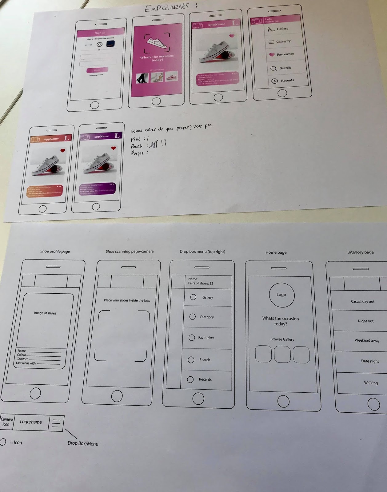
In the critique I made a little note which asked people to vote on which colour scheme they preferred the most out of the original Pantone pink gradient, a peach gradient and a purple gradient. As I thought that the pink may be a little bit too girly. The peach got 7 votes where as the pink got 1 and the purple got 0, I am happy with this vote as I also think the peach works best, its still feminine without being too over the top. The peach is also more vibrant, making it more exciting.

Feedback;
My response
- Sound idea- would be simple enough to use. Good idea to have a gallery for users to store their shoes
- As well as 'last worn with' you could have 'best worn with/would pair well with'
- Simple layout
- Prefer the orange/peach colour scheme personally- I agree
- Nice concept- something I would use. I like that it works off an occasion- most of the time I wear the same shoes other than an occasion- Thank you, since my peers would personally use the app. it means that it would work in the real world which is the aim.
- Wireframes looks polished and professional
- Could you use outfits too? Not so much the whole app for clothes but could you upload an image of your outfit and change the shoes on the app so you can see what the overall outfit will look like?- I did consider this, however I want the focus to mainly be on the shoes and not clothes as well since it could become too complicated. Keeping it as just shoes makes the brief more focused.
- Maybe try some other layouts too? This is effective but many too obvious? I will continue experiment with a few different layouts for each page before deciding on one.
- Could you make a mens version? I know many guys that would use something like this- This could be interesting, or I could just make the app more gender neutral? I will make a mens version and see how I feel then. However, a lot of people that I spoke to mentioned that the brief is more appropriate for women
- The app looks like it would be easy to navigate through- which is good as in a scenario where someone is limited for time and needs to find a pair of shoes to suit their outfit
- Easily accessible, this is the best approach
- Could your colour schemes be more relevant to the shoe store you link it to? Whilst having a heavily feminine colour scheme? e.g. clarks- a green/cold colour scheme. Linking to brand identity? The app is an extension for a few different shoe apps, not just one so i'm not sure this would work
- I like how you have integrated similar layouts to insta/snapchat as they are apps that people are pretty familiar with- links to ease of access- Thank you, I didn't realise myself that the layouts looked similar to them.
- Like the idea- does it need to be limited to just women?
- Could you expand the app? Say if the user needs a new pair of trainers for the gym could the app suggest some based on the shoes the user already has in their collection? I like this idea, a 'suggestions' feature would be interesting and effective as it would promote the other shoe apps.
- Could the app have a feature encouraging you to wear a pair of shoes that you haven't worn in a while? Prevents the user forgetting about certain pairs of shoes
- Are you able to look at other people profiles and see their shoes? More interactive- This might make the app less personal?
- I like the peach colour scheme and I think it will appeal to a wider audience- not all women are super girly whereas the pink is- I agree
- Well considered
- Could you also have a 'when last worn' bit so you ensure you're not wearing the same shoes all the time
- I love this idea. I like how it can categorise the shoes for you automatically
- The idea of taking pictures of all your shoes could be lengthly but once the start up process is done it would be very easy to use- The app allows you to add/scan more shoes whenever the user wishes, they don't have to add all their shoes at once but they can if they want to
- 'Shoes you may like' page? Links to the 'suggestions' feature'
- How would you make the camera work functionally depending on lighting etc- The scanner page shows instructions like 'place your shoes in the box' or send alerts/notifs like 'improve lighting'
- Like the heart icon- could this also be a wishlist? I think the heart icon is more appropriate for the 'favourites' feature, as the user probably already has shoe wishlists on the other shoe apps, you can't actually buy shoes through this app alone so it wouldn't be relevant

No comments:
Post a Comment