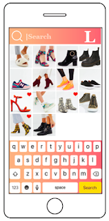
I showed two of my peers all of my app pages/links so far and asked what they think still needs tweaking before the final critique on Friday.
The main things that they said may need tweaking is the colour of the drop box menu icons from the black to the peach gradient and the colour of the yellow search box to match the other buttons. One comments mentioned to possibly re-consider the size of the text box/rounded edges on the shoe profile page, as it could look a little bit like a text box/message box. However, the rounded edges match the overall aesthetic of the other pages as rounded edges are used on most pages for buttons and images.
1.
 |
| Before (black icons) |
 |
| After (peach gradient icons) |
2.
 |
| Before (yellow search button) |
 |
| After (search button changed to match the colour of the rest of the buttons) |
3.
 |
| Before (rounded corners text box)- I still think I prefer this version |
 |
| After (rectangle text box)- this looks a bit out of place with the rounded corners photograph |
I have also developed the gallery page as I felt that before it looked too similar to the layout to the search page link. It is important for them to follow the same general aesthetic but there does need to be a slight difference because they are different pages. The bigger photographs on the gallery page also make them easier for the user to see, it doesn't matter so much on the search page.
 |
| The search page |
 |
| Gallery page (BEFORE) |
 |
| Gallery page (AFTER) |
No comments:
Post a Comment