Thursday 31 January 2019

Further Research

Since our idea for the concept and proposition of the exhibition focuses on the idea that every piece of art tells a story- relating to how much time, research, and the overall development process that goes into creating work at our university (the whole story). We know that we want the design to also reflect this through focusing on design and aesthetic relating with stories: fairytales, journey steps, books, childhood/nostalgia. The idea of every piece of art telling a story also relates to the journey of how Leeds Arts University became what it is today

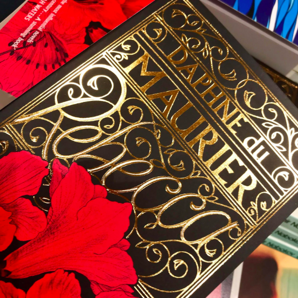
For typography I have researched into old gothic medieval typography that is often used in old classic story books such as Cinderella, Snow White, grimm brothers books and more. The old medieval typography would look interesting if it were used for the title on the flyer and/or poster.


Additionally, I have also researched into classic children story book covers. I noticed that a pastel colour palette is often used which is what I researched into previously, also that the covers are often very busy. However, I think a more minimal approach than these would be more appropriate as we want the branding to appear professional to the people from industry visiting, containing all the important information alongside clever imagery/photography relating to the concept.

Another design that these covers often use is decorative antique page borders, this could be interesting to use in the poster design perhaps, but in a more subtly. Furthermore, another thing I noticed is that the main image on the cover is often is also in a shaped border, it would be interesting to create imagery that had to stay in a border/strict grid system within the page.


Mood board created by Jess from my group

Wednesday 30 January 2019

Colour Research

The concept and proposition that we discussed for the exhibition focuses on the idea that every piece of art at the exhibition tells a story- this concept relates to how much time, research, and the overall development process that goes into creating work at our university. The big idea for our exhibition focuses on how its not just a pretty piece of work but that everything has and tells its own story.

Furthermore, the design could reflect the idea of a story/journey. We discussed things that we relate with stories: fairytales, journey steps, books, childhood/nostalgia, pastel/light bright colours. I have started with researching into colours:

One of our original ideas was that gold could be used consistently throughout the exhibition branding in order to reflect the colours of the new university building, gold also relates to fairytales as the metallic relates to fairytales being 'magical'. However, the only issue is that foiling a lot of the deliverables may be very time consuming as the deadline is only 2/3 weeks away, perhaps maybe just the flyers could use gold foiling. Additionally, yellow could also relate to this as it is the most similar non-metallic colour to gold.


Example of gold foiling that I saw
at a book store in the past 


Additionally, Pantone actually has a colour titled 'Fairy Tale'. Jess mentioned during the discussion that fresh, pastel colours reflect on the idea of fairytales so this colour would be perfect. I also think the softness of the pink relates back to childhood (reading stories as a child).


Also, fairytales and stories were often read to us as children during night time; the use of a dark blue shade would relates well to the idea of night time. I found this shade would work well as it is quite a warm dark blue shade:


Another pastel colour that I think would work well with the two colours above is a light green/turquoise shade .Additionally, green is often used in stories and fairytales as the scenes are often set in the outdoors/woods/nature settings. Below show two green shades that I think would work well:


Final Posters

I have now finished my posters ready to print on Friday. I am happy with how they have turned out as the photographs are well shot and crisp, the minimal aesthetic helps to get the message across quickly and successfully. The brief tackles quite a sensitive topic so I didn't want to over complicate them with a more wacky, busy overall aesthetic. The hand written text needed quite a lot of playing around with but I am happy with the positioning and sizes of them now. All three posters focus on the concept of making carrying a condom the 'norm' through incorporating a condom in everyday normal activities that people do.

The first poster focuses on the idea of making a cup of tea, the condom has been designed to look like a string tea bag with the tag using a Durex inspired design (the logo and a short sentence about the spread of STIs). The second poster focuses on the things that we don't leave the house without: card, keys, ID, through making the hand written type look like a checklist. The condom was photographed along side these objects, implying that a condom should also be one of the things we don't leave the house without. Additionally, the third poster focuses on the everyday activity of brushing your teeth and not leaving the house without doing so, this has been done through editing imagery of condoms into the bristles of the toothbrush. 


Exhibition Initial Ideas

Today I met up with Jess and Annie for Creative Advertising to discuss the research that we had each gathered so far. We all had a lot of really good ideas and it was useful to bring them all together in order to push further the ideas that we found most interesting. We also discussed the proposition and insight for the exhibition.

Notes and ideas to take further from the discussion:

  • Exaggerate the fact that Leeds Arts University is number 1, this encourages the professionals to come. Keeping the connections going, lets them know the students here create good work and are interested in them and their practice as well.
  • Gold foiling could be used in the designs to relate to the look of the new uni building
  • Yorkshire slang to make it original to Leeds, could relate to the name of the exhibition, as the main thing that all of the courses have in common that it is in Leeds...
  • Research into Leeds and Leeds Arts university (started in 1846). However, we felt that everyone might be researching into it and we want our concept to be unique and more interesting.
  • Leeds arts uni sign is distinguishable; have that somewhere on the branding
  • Links to industry
  • What do we think when we hear 'Leeds'?: Hyde Park, pubs, the accent

We also discussed what made us want to come to Leeds?: Rather come to a specialist arts university, just loved the feel of Leeds in general because its so friendly, the variation of all the different courses helps you decide what if you don't actually know what you want to do...want to do something artsy but didn't know what

The concept, insight and proposition that we found most interesting through our discussion focuses on how much time, research, and the overall development process of a piece of art and everything that goes into making a piece of art work and how every piece of art has its own story and journey to how it became the final product:

  • We don't just make 'pretty art', theres a lot more that goes into our work. A lot of the courses are very academic and research based. Art isn't just painting and drawing. Promote this idea.
  • Proposition/tagline: relating to the fact that there will be something for everyone or that its not just art its art with a meaning. Everything requires craft before even getting to the 'art'.
  • Final proposition idea: Everything has/tells a story

Furthermore, this proposition and concept lead to more ideas for how the design could reflect the idea of everything/every piece of art having its own story...The design could look like its actually telling a story! What do we think when we think 'story'?: Fairytales, steps, books, childlike/nostaglic, pastel/light bright colours. I will now research more into how the design could have fairytale, story-like aesthetic.

Tuesday 29 January 2019

Initial Research and Inspiration

As a group, we decided to all meet up this week and bring some research that we have done over the past couple of days, my job was to mainly research into design ideas that we could take inspiration from. The first point of research that I did was from the previous Leeds Arts University degree shows, the examples that I found include work from 2012-2018.

I noticed that the designs are often quite minimal which gives a professional aesthetic, containing the main information such as location and times, as well as a promotional sentence/tagline. However, I think a more fun, bold aesthetic would work better in order to communicate the ongoing creativity at the university, this would also mean that the branding would be different from all the other years.


I also gathered some research on other end of year degree shows from other Arts Universities that I found interesting (Foros school of architecture, Bristol, UAL):


When briefly discussing ideas for the designs of the exhibition with Jess and Annie, we agreed that the designs should all have a consistent aesthetic that is fun, bold and bright, in order to reflect the diversity of all of the different courses on at the university, as well as the diversity of all the students that come to study at the university from all over the world. We also agreed that the branding needs a consistent colour palette of around 4-5 colours. 

The initial design inspiration that I found interesting includes work from the 2018 D&AD Festival Branding, Studio Appelle Moi Papa (graphic design studio in France), flyer designs created by a range of different designers (Felicite Landrivon, Brodie Kaman, Toru Kase) and more general branding designs that I found interesting.


SB2 Collaborative Brief- Creative Advertising

For Studio brief 2, I am collaborating with two Creative Advertising students; Jess (art director) and Annie (copy writer). My role is the Graphic designer but we will all have input into the concept/ideas, design and research. The brief requires us to create the concept and promotional campaign for the Leeds Arts University annual end of year show. This needs to include the Foundation End of Year show which takes place 16 May 2019, as well as the Degree End of Year show which takes place on 7 June 2019.

The exhibition branding needs to successfully attract the people from industry that can actually give graduates jobs, as well as attracting people in general to come. The design concept needs to be representative of all of the courses, so the concept should aim to be as creative and eye-catching as possible.

Deliverables include:

Mandatory:
  • External Signage Blenheim Walk. Signage covers the four sides of the brick folly, each panel measures approx. 2260mm x 4030mm. 
  • A0 Poster. For the poster towers in and around the city centre and Hyde Park, Headingley etc. Poster must be bright and bold to stand out from the ‘noise’ created by other advertising. 
  • A6 double sided flyer to distribute around bars and venues in Leeds. 
  • Publication Adverts. Several adverts for printed publications. 

Optional elements:
  • Private View Email Header. A high quality digital invite sent out mainly to industry contacts/ friends to promote the show. Animation and interactive elements are welcome.
  • Online Graphics. Several graphics for our website, social media channels and online advertising. 
  • Exhibition Guide. A printed guide handed to visitors at Blenheim Walk to guide them round the exhibition. 
  • External Signage Vernon Street. Usually includes 3 or 4 pieces of external signage.

Our first point of research was to walk around the University (old building and new building) in order to find some inspiration of how we could start approaching the brief. We all took photographs while we did this as well as gathering leaflets/flyers that we found around uni whilst exploring.


Friday 25 January 2019

Concertina Cover/Pouch Development

I have started to create the designs for the cover/pouch that the concertina book and stickers will slot into. The size of the cover is around 1cm bigger (length and width) so that the book and stickers can both easily fit in. The idea of a cover relates to how condoms are covered/protected with a wrapper. 

After creating some simple tests for the cover I created a final template to create my designs in. Additionally, the cover has zig zag edges at the opening fold, which takes its inspiration from the jagged/zig zag edges that Durex condom wrappers have at the top and bottom.

The cover simply takes its inspiration from a real Durex wrapper, as the concept for the size of the concertina book and cover also comes from a condom wrapper. I have edited the cover to look like a Durex condom wrapper, however I have changed the type on it to the tag line that I have used throughout the campaign: #Make it the norm.

Original wrapper

Edited wrapper with the new text/hashtag 

An original Durex wrapper says '1 natural rubber latex condom'. It says it in 4 different languages in separate lines; English. French, Spanish and Chinese. I have stuck with this layout and translated '#Make it the norm' in the same languages:


Close up

I created the design in red and blue which both match the type on the cover of the concertina book, as well as being actual Durex condom flavours/colours. I prefer the blue, peers also agreed that the blue worked better, one peer comment mentioned that the blue had a more informative aesthetic.

When printing the final cover/pouch, I will print it either onto card so that it is more durable or satin/gloss paper to relate to the texture of a condom wrapper, however im not sure how well satin or gloss paper would fold. I will need to experiment with both options and see what works best.


Cover mockup


Blue vs red

Sticker Printing

I have now printed my stickers that will go along side the concertina book, they will also work as a free-be inside boxes of condoms. Having the stickers available in two different contexts means that the campaign would gain more publicity and popularity as it encourages more people to wear the stickers out in public.

For the concertina book I had 3 different ideas of how the stickers could work along side the book. The 3 stickers could either fold out using one strip of sticker paper that folds back into the page dimensions (5.5cm by 5.5cm). The second option was that each sticker would be separately stuck on the back page with perforated edges so that the reader can rip each sticker out. The third option would be to keep the stickers and concertina book separate since they will be in slotted into the same cover, the stickers would simply be slotted behind the concertina book inside the cover.