I have started to create the designs for the cover/pouch that the concertina book and stickers will slot into. The size of the cover is around 1cm bigger (length and width) so that the book and stickers can both easily fit in. The idea of a cover relates to how condoms are covered/protected with a wrapper.
After creating some simple tests for the cover I created a final template to create my designs in. Additionally, the cover has zig zag edges at the opening fold, which takes its inspiration from the jagged/zig zag edges that Durex condom wrappers have at the top and bottom.
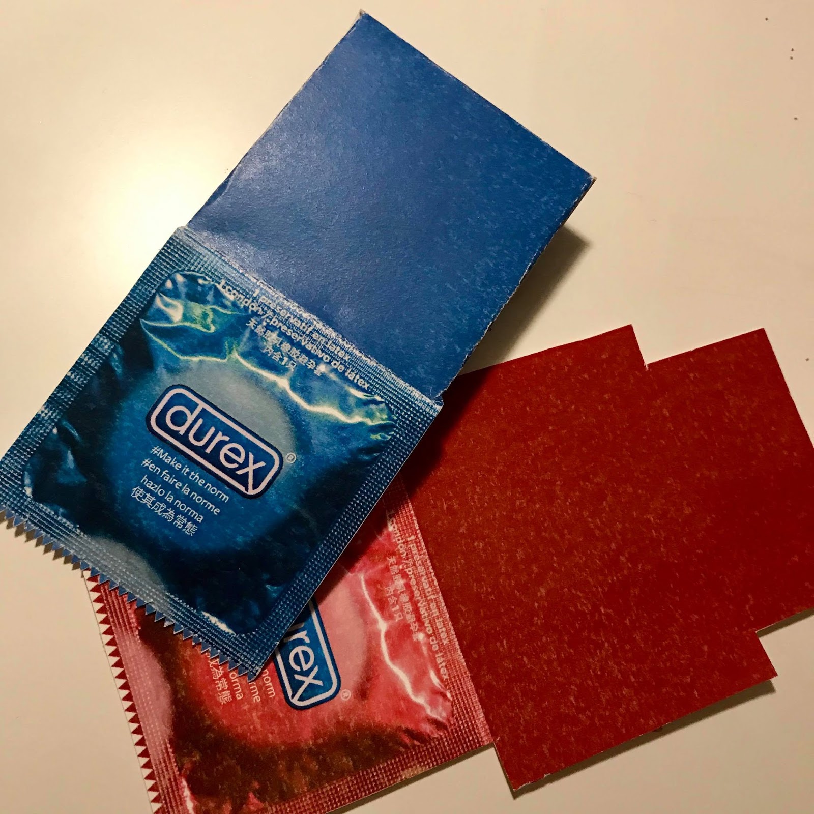
The cover simply takes its inspiration from a real Durex wrapper, as the concept for the size of the concertina book and cover also comes from a condom wrapper. I have edited the cover to look like a Durex condom wrapper, however I have changed the type on it to the tag line that I have used throughout the campaign: #Make it the norm.
 |
| Original wrapper |
 |
| Edited wrapper with the new text/hashtag |
An original Durex wrapper says '1 natural rubber latex condom'. It says it in 4 different languages in separate lines; English. French, Spanish and Chinese. I have stuck with this layout and translated '#Make it the norm' in the same languages:
 |
| Close up |
I created the design in red and blue which both match the type on the cover of the concertina book, as well as being actual Durex condom flavours/colours. I prefer the blue, peers also agreed that the blue worked better, one peer comment mentioned that the blue had a more informative aesthetic.
When printing the final cover/pouch, I will print it either onto card so that it is more durable or satin/gloss paper to relate to the texture of a condom wrapper, however im not sure how well satin or gloss paper would fold. I will need to experiment with both options and see what works best.
 |
| Cover mockup |
 |
| Blue vs red |


No comments:
Post a Comment